I am looking at space and construction as an art form. Discovering the connection between light and constructed space by experimenting with the idea of light as an element which can distort our perception of reality but also bring clarity to the objects and spaces it touches. This process is coherent to my film making in the way it looks at the changing perceptions within the confinements of an interior space; the only difference being these spaces are constructed and thought out by me, whereas the film is a documentation of the changing perceptions in an existing living space.
Creating forms and structures to experiment with the concepts within the poem 'Yes, Here's the Room'.
Transition / Time / Reality / Perception / Light
I am learning throughout my practice the diverse ways of communicating to an audience. I experiment with a diversity of materials, forms, colours and light to communicate conceptual texts and poetry. I can apply this knowledge to communicate the identity of space, by understanding the raw elements and their relationship to an audience. This project allows me to show the transition I am making into interior design. I believe the act of being an interior designer is to understand the raw elements which are involved in the creation of space. This means that when you draw these elements together you can better understand their relationship to each other, and the effect they have as a whole on the people occupying the space. I am experimenting with these raw elements, stripping back their use and specific functions to see them in a purer form.
Light and Illusion
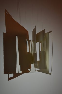
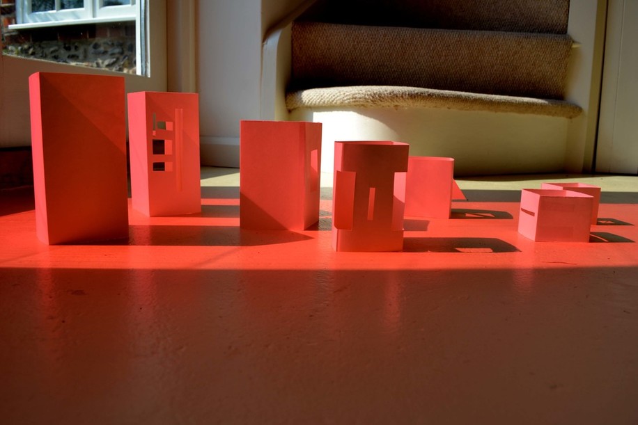
I am exploring the idea of perspective, and how we detect between reality and illusions. My practice is greatly revolved around 3D design, working with paper is a part of this process. I use paper to test ideas, such as experimenting with form and light. The poetry I am working with sets an atmosphere and narratively illustrates the changing visuals throughout the time of day. This paper model aims to communicate the transition of time and how the movement of light transforms and changes our perception of the built environment.
|
|
|
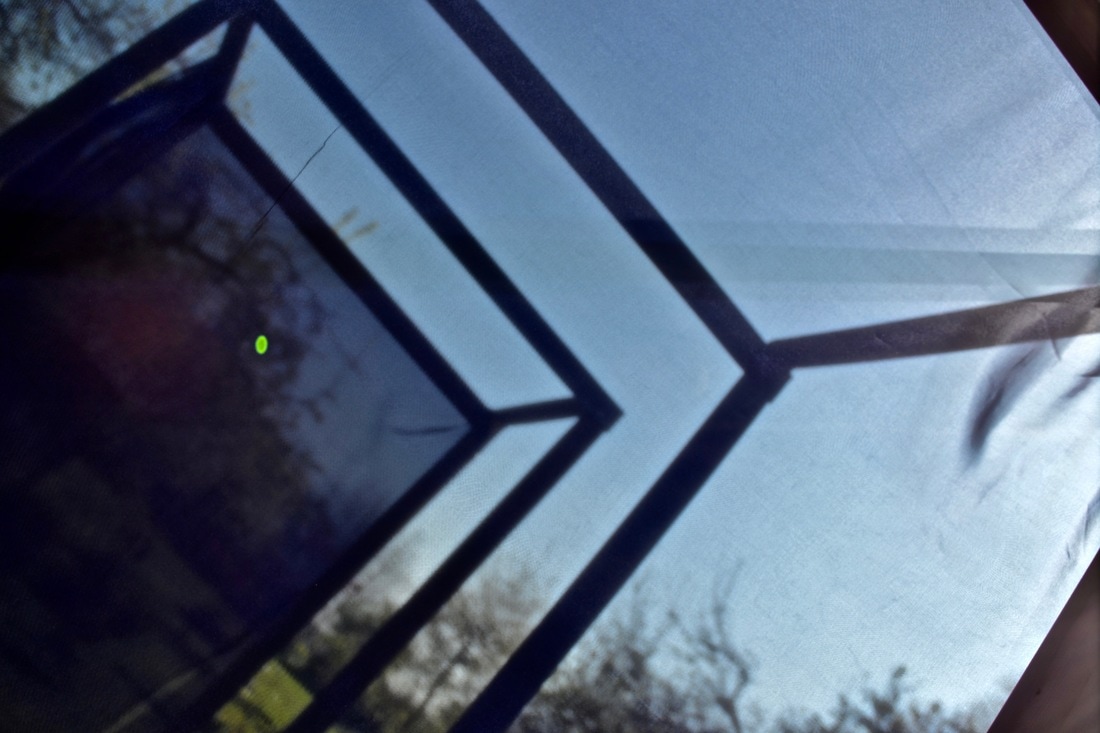
The minimalistic form of this paper model is inspired by shapes or windows, doors and alcoves within the interior of my home. Each layer of paper represents a room, the layers as a whole create depth through the illusion of space in between each layer.
I find it interesting how shadows can carry the form and make the structure seem even larger and more atmospheric then the reality of the structure. This can be compared to our perception of the built environment as natural light passes through the architectural forms, beautifying buildings which would otherwise seem mundane.
Shadows, Colour and Form
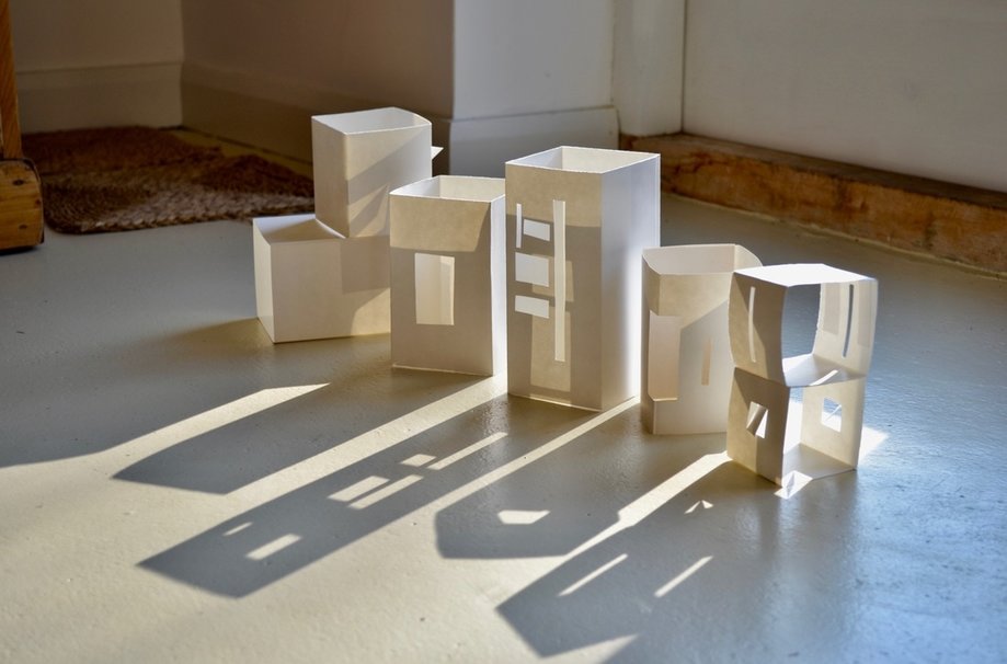
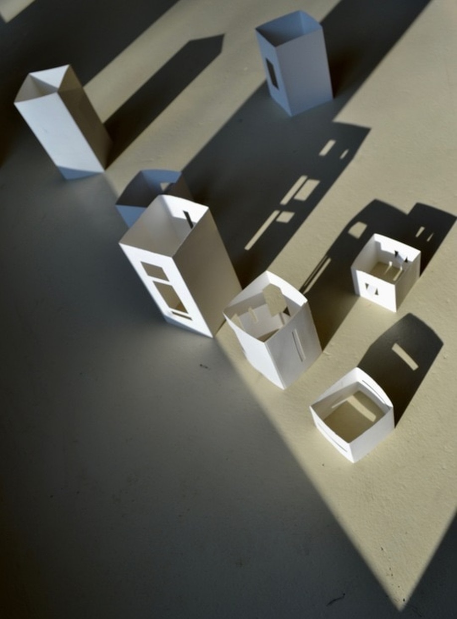
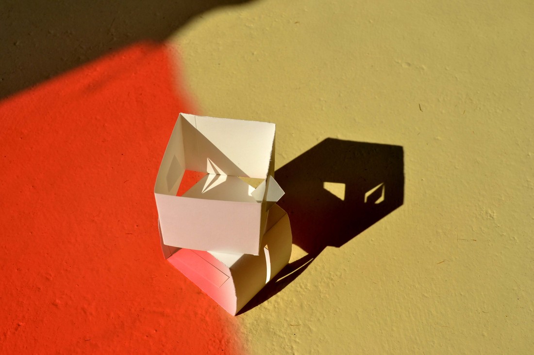
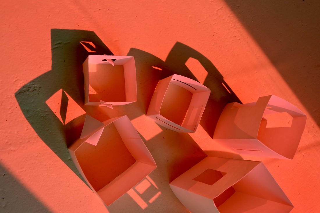
These paper models were another form to represent the built environment. I used them as structures to experiment with the movement of light and how it can create the illusion of depth and distorted forms. I used coloured cellophane against the window to change the colour of the light, this changed the atmosphere and mood of this created environment.
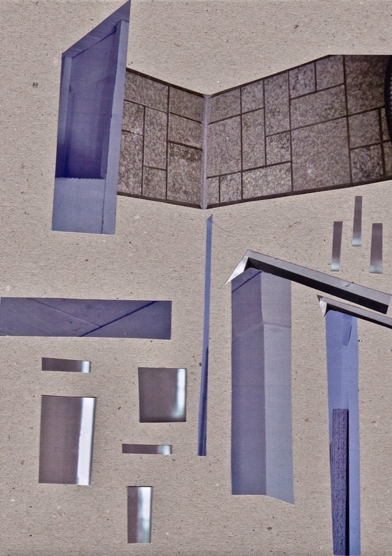
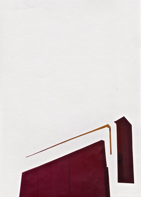
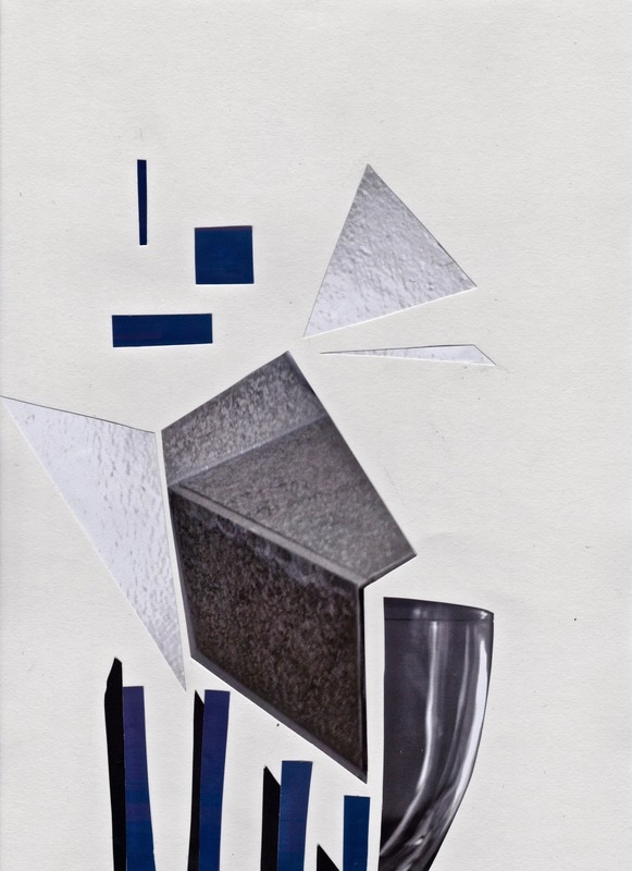
Architectural Collage
Translating these mundane forms into new architectural environments
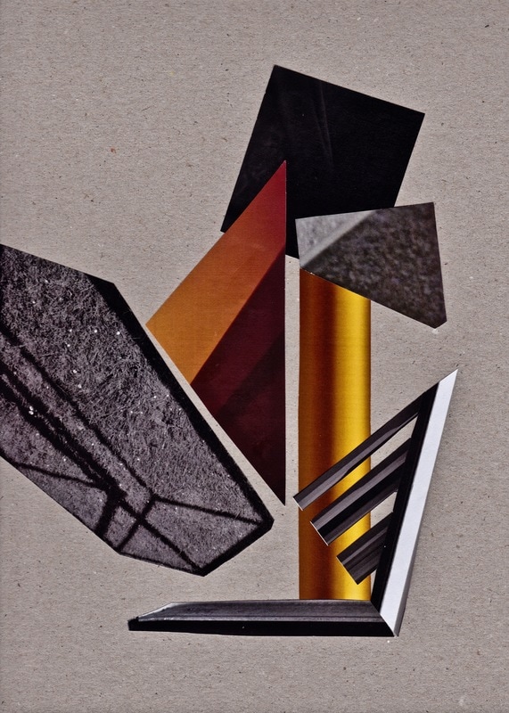
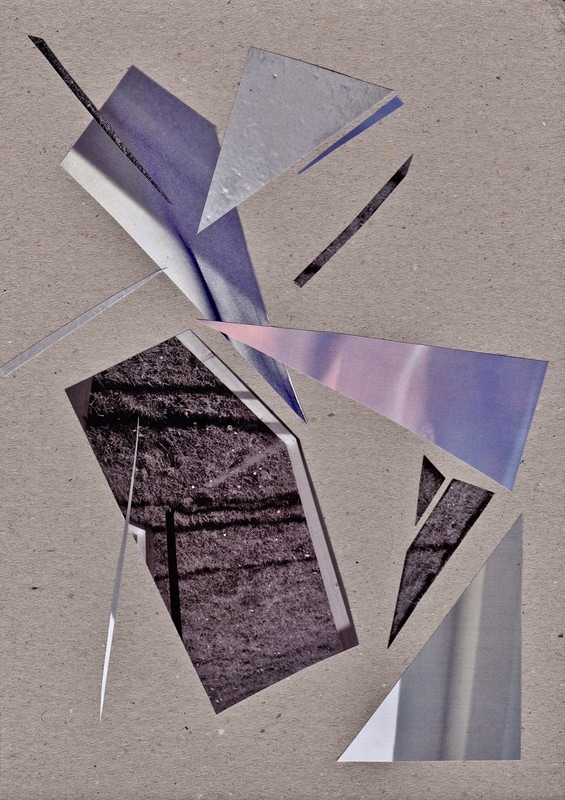
I made these collages to inspire me to see the visuals of the poem in a 3D form. I needed to begin to think in 3D in order to design and make the structure of the installation. I felt like I needed this step of playing with 2D to 3D between the poem and designing the structure so that all the elements of the installation are coherent. Even though I know that these images are in my head and my mind will be visually inspired by them when I am designing the structure, it is still helpful to physically cut out and form 2D structures to see how my visual ideas form and transition throughout my process.
These collages are structural forms which I created whilst visually picturing them in larger scale, the size for human interaction.
|
|
|
|
|
I created these architectural collages from the photographs I was taking in response to the poem ‘Yes, Here’s the Room’. I wanted to take the angles and forms out of there original habitat, and instead of seeing the objects in relation to their surroundings, I began to see them as they really are. This allowed me to appreciate the shapes and forms of a mundane environment, and see how they could be translated into creating new architectural structures to inspire the design of my installation.
I played around with the scale of the printed photographs. This enhanced my ability to see the objects in a new light, and therefore effectively giving the objects a new purpose as an architectural intervention.
Designing the Structure
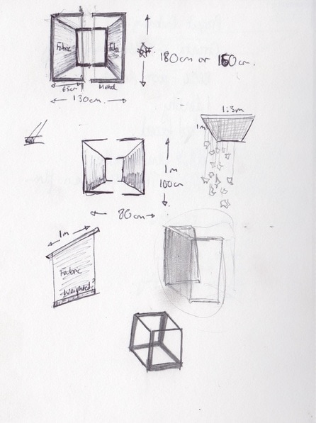
The installation 'Kit' will incorporate a standing structure which acts to identify a space separate from the environment it will be in. I will play and experiment with objects, materials and positioning within this standing structure in relation to the interaction of the projected film, in order to establish an effective piece which which communicates the changing atmosphere within my constructed poem.
The installation 'Kit' will incorporate a standing structure which acts to identify a space separate from the environment it will be in. I will play and experiment with objects, materials and positioning within this standing structure in relation to the interaction of the projected film, in order to establish an effective piece which which communicates the changing atmosphere within my constructed poem.
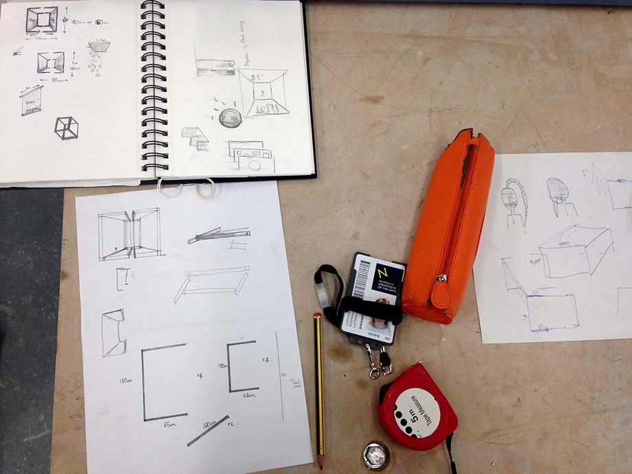
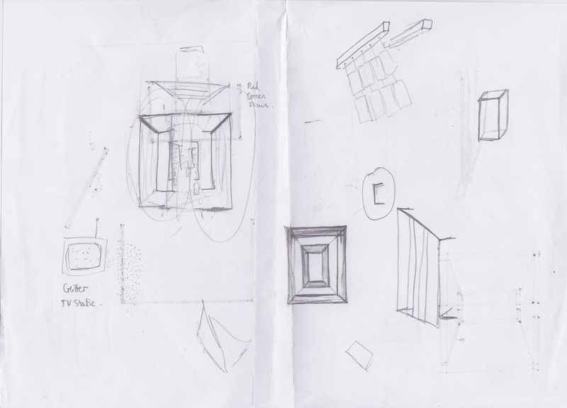
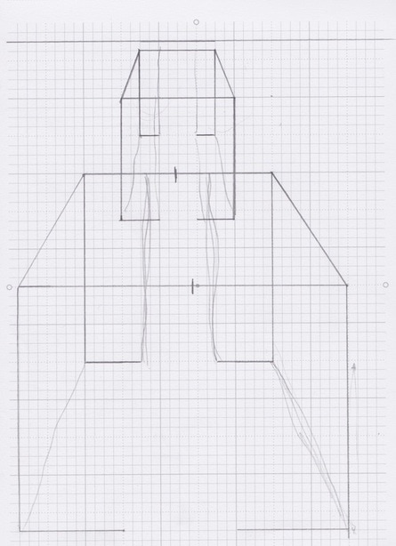
These sketches illustrate more thought process when designing the structures. I wanted to create a detached cube shape, this would give me flexibility in how a position the installation in relation to the objects and projection. When I talked to Jim about my idea he said that the top feet of the cube would have to be attached otherwise it wouldn't stand. So I decided to use a separate piece of steel to join the top feet, it would have adjustable holes so the distance between the two walls could be changed. I also had to change the way the fabric would hang - I originally wanted a steel strip to be unattached to the structure, almost like a curtain pole which I could slide the fabric onto, however, again the steel would not be steady enough to hold this so that piece of steel had to be attached. I made sure that the structure was still flexible by using adjustable holes, and none of the pieces of steel were permanently fixed so I could take it apart and experiment with it in different spaces.
I had also designed a separate metal grid which would be the right size to sit flat on the top of the structure. I wanted this to hang reflective materials from. I decided to source this product as the 3D workshop was shut over Easter and I was running out of time. I found a rusty metal grid from a junk yard which had previously been used as reinforcement in concrete flooring.
|
|
|
|
|
How did the poem inspire this structure?
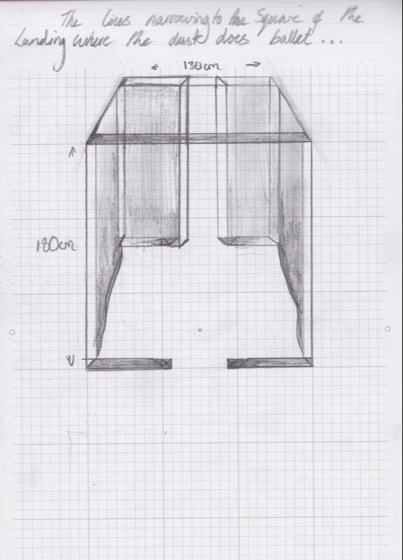
From the poem I created, I picked out forms and spaces which were described, such as:
Private sphere, dense blue curtains, transparent bottles, eaves, alcove, corridors, hallway, square of the landing, screen, corner, ribs, plain wood and walls
These structures and forms inspired my design. As shown above, I started manipulating the photographs I took in response to the poem, transforming them into new architectural forms. I considered the words above such as 'eaves' when making the collages. From these I began to think in 3D and was inspired to create the structure in the drawings above.
The poem describes changing interior environments, so the structure isn't responsible for illustrating this, that is the purpose of the film. However, the structure needs to utilise and play with the projection, whilst also maintaining a constant form. I wanted the form to represent a threshold space (a hallway, doorway, entrance, alcove), acting as an interface between the film and the space it is in. The film illustrates the transition between rooms within the interior space. The structure acts as the threshold which leads you into or out of the changing spaces in the film, like a doorway, the audience decides whether they are leaving or entering the space.
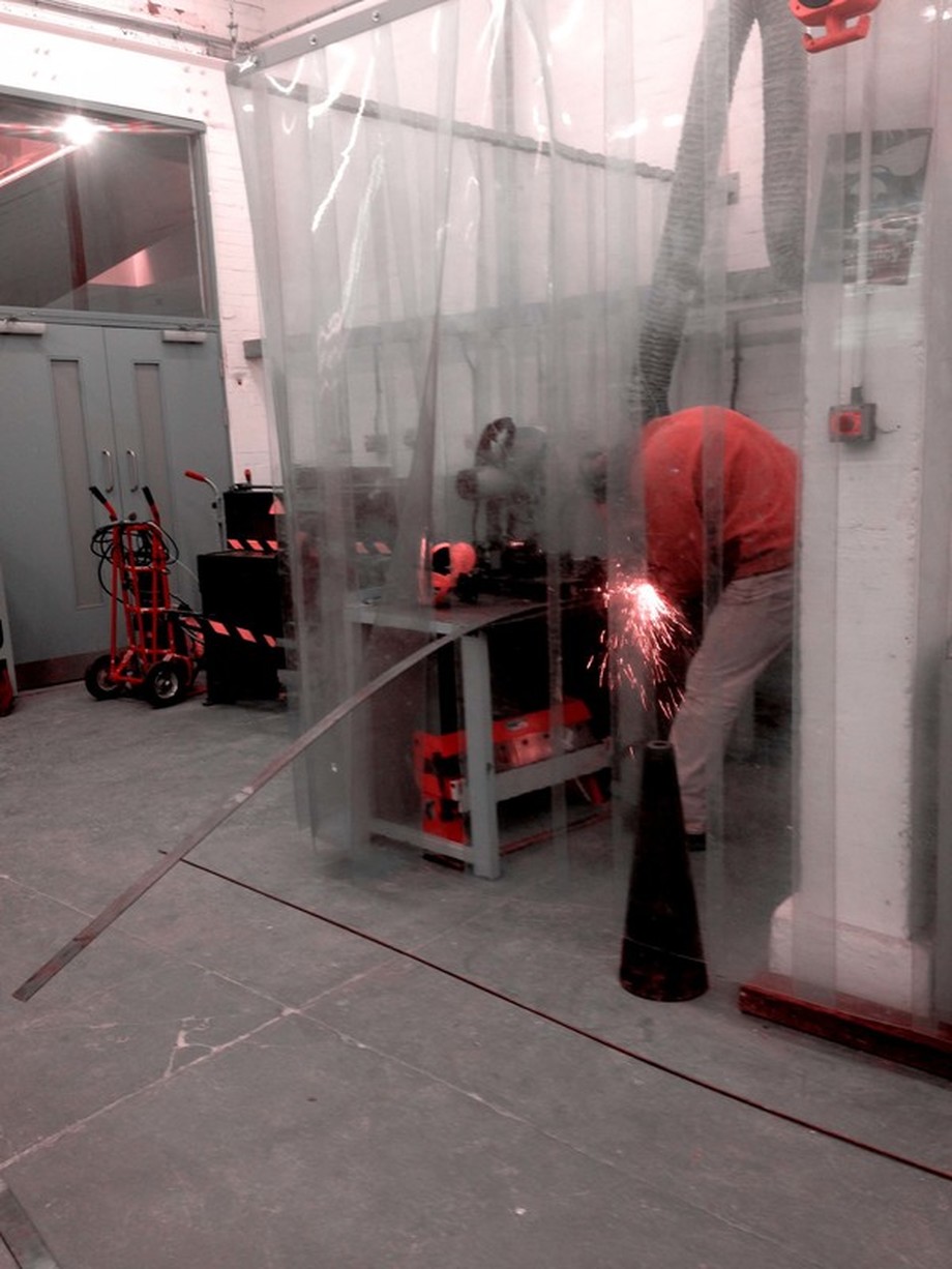
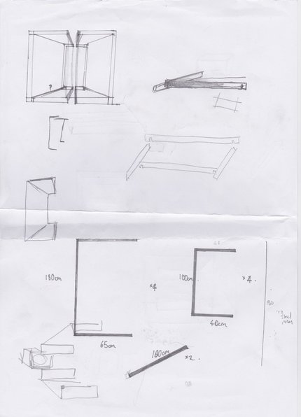
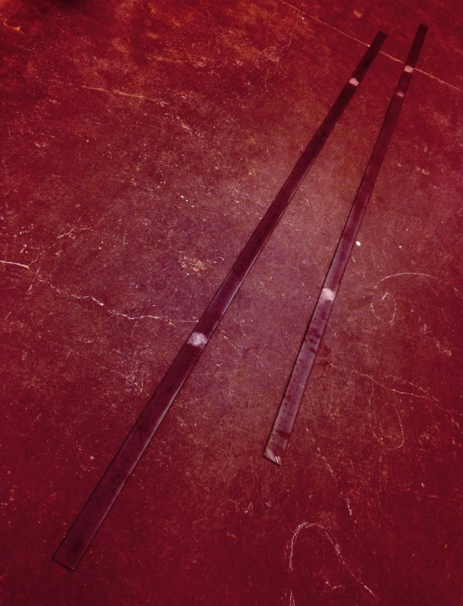
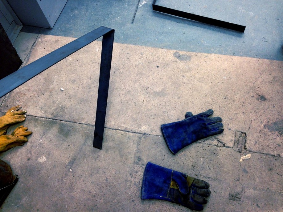
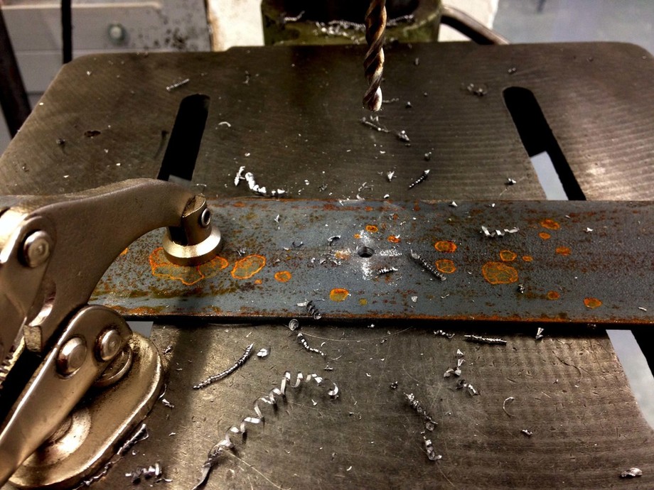
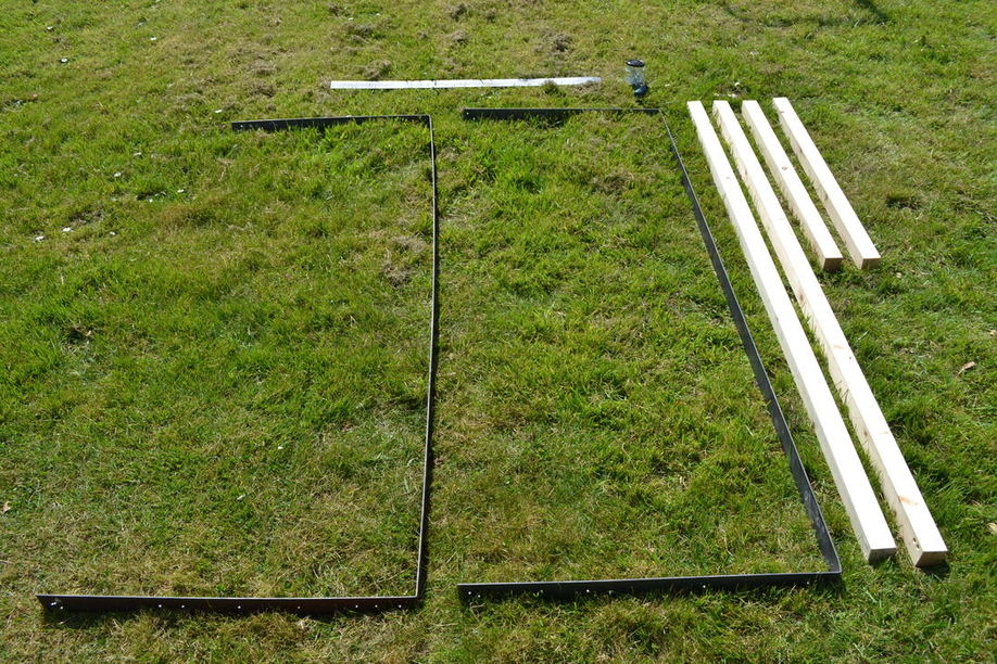
I chose to work with steel because it can hold an elegant and refined form in comparison to wood. It is also more malleable when wanting to bend or curve a continued piece, avoiding the risk of uneven surfaces when connecting separate pieces of wood. I have worked with steel sheets before but never steel in this form, it was very challenging. As you can see from the drawings below I am bending these steel strips (4m in length) in two places to create a shape like this - [ ].
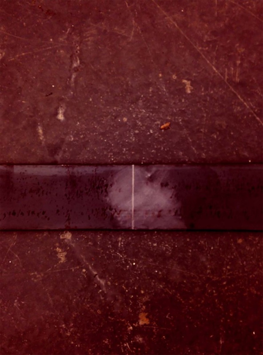
The first job was marking up the steel and making deep grooves in order to allow the bend to be a straight 90degree angle.
I used fixed clamps to hold the weight of the steel whilst I bent it. I didn't need to apply much pressure as the steel was so heavy it carried the metal above the groove down. The length of the steel made this very awkward.
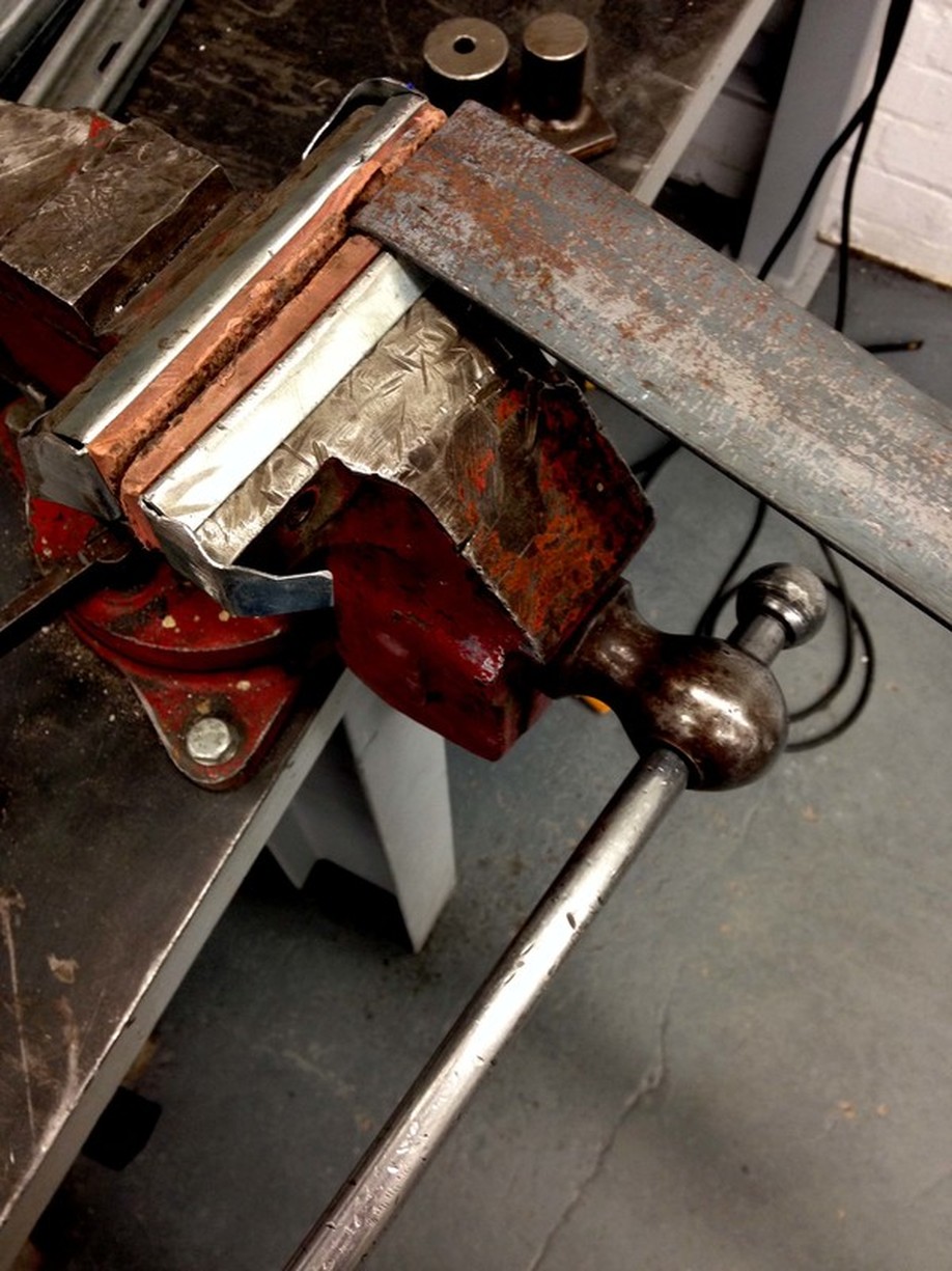
Some of the bends weren't quite 90 degrees, they were a bit curved. I had to tap the metal with a hammer to straighten these out.
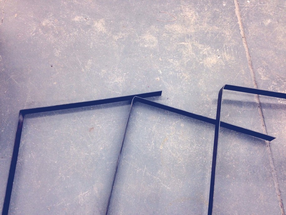
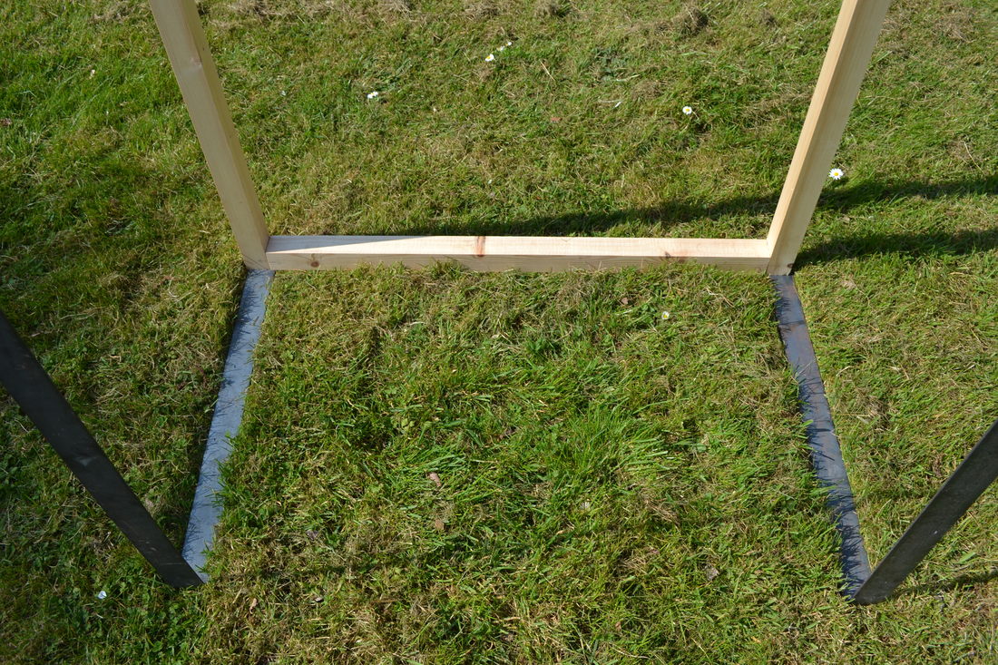
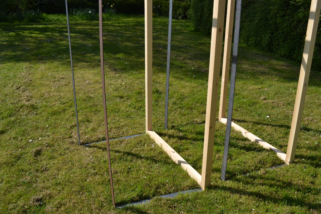
The next part of the process was drilling holes in a separate length of steel, this piece supported the structure, with out it the steel would sag and curve.
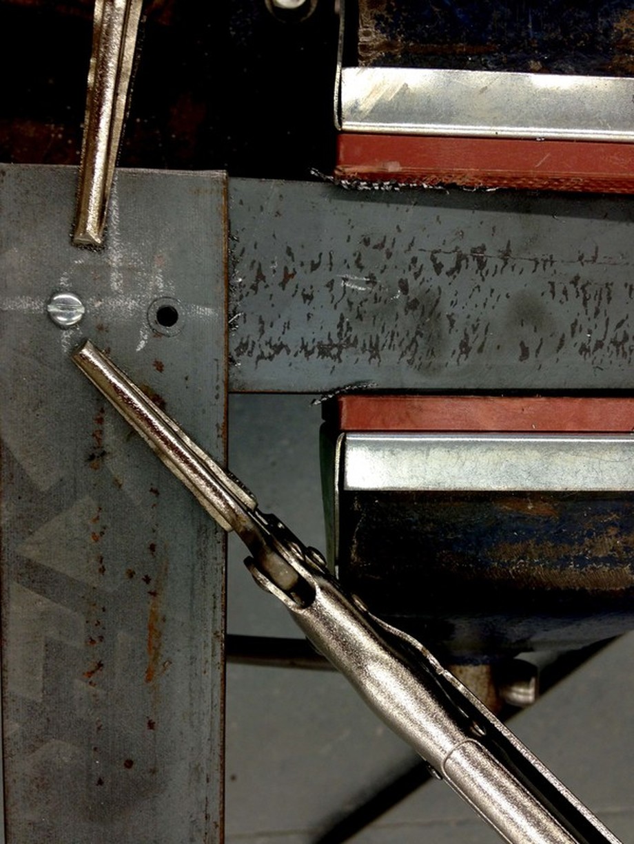
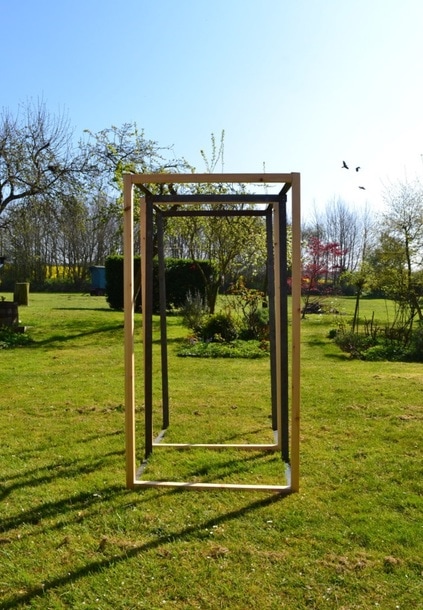
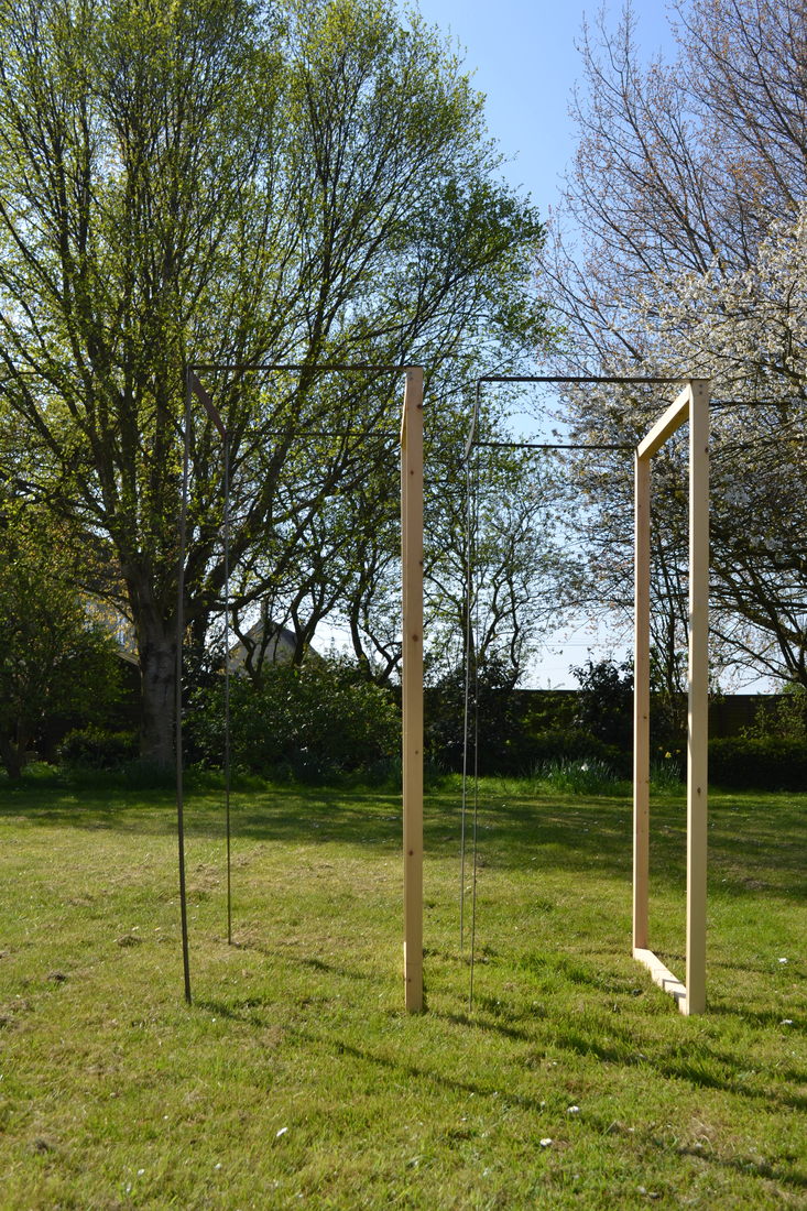
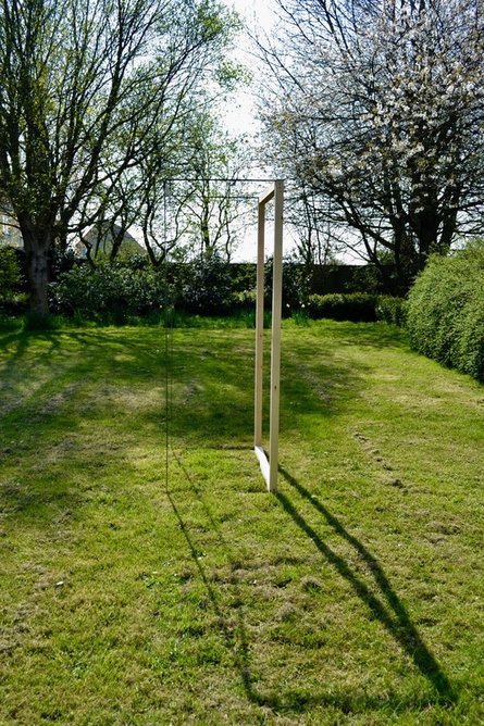
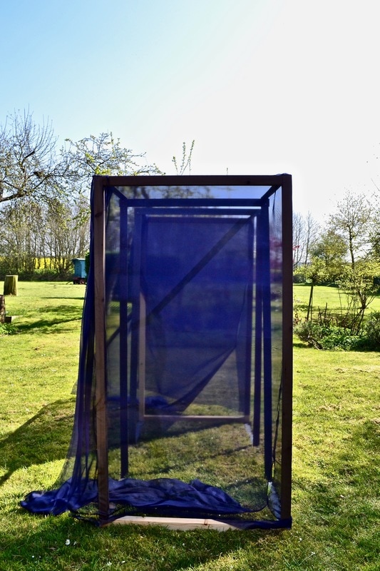
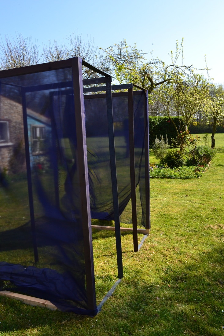
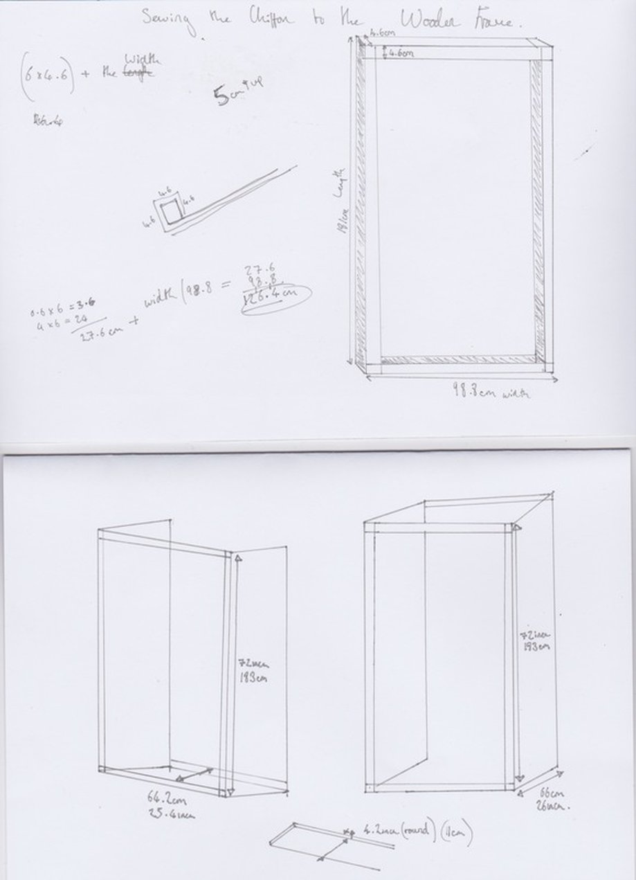
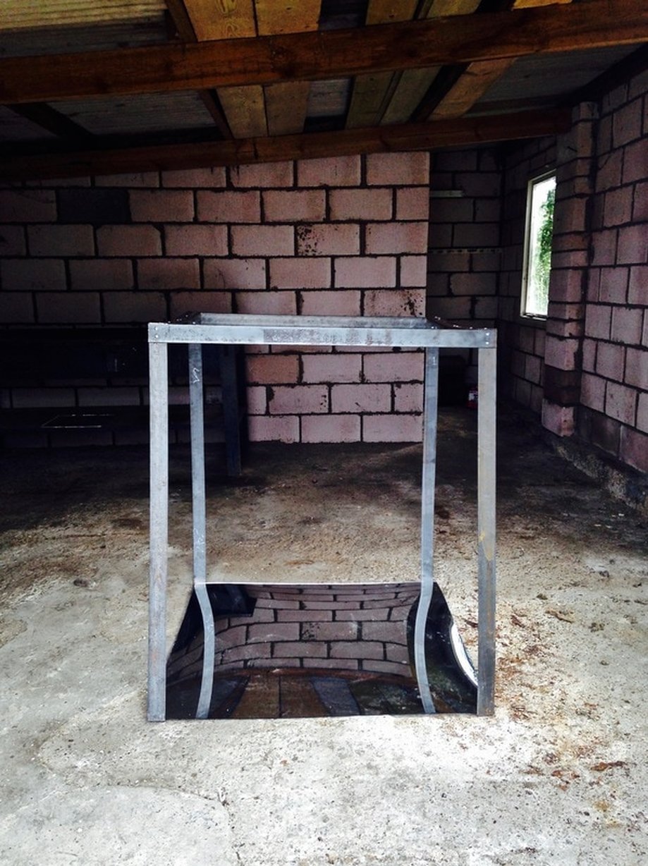
I created two sizes of this structure. The smaller structure is 100x100x40cm, the larger structure is 100x180x65cm.
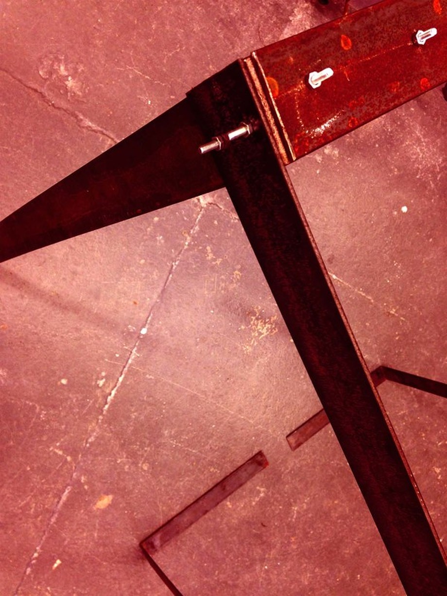
These are both structures just after I had finished making them resting on their side. It was clear the structures are quite weak, when they stood up they buckled slightly, it didn't look elegant or professional. I decided to create a support system for the steel in pine wood. The most important purpose of these structures was to be simple, self standing, safe to walk around, and portable.
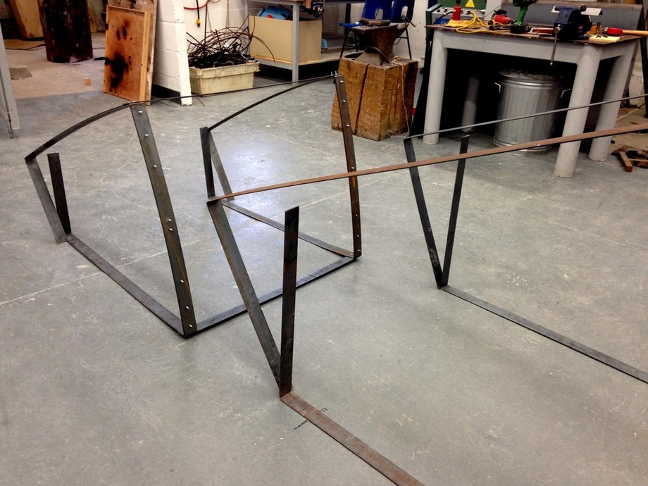
The aim was to create structures which are portable, and adaptable to diverse spaces. These structures are very adaptable they are not connected which means I can position them in different ways depending on the space and the projection. I can also separate the wood from the metal, there is no fixed puzzle, it's interchangeable. I liked having this flexibility however, it made the design a lot more challenging because it needed to stand and be self supported, whilst also being safe enough to display in an exhibition space. The weight needed to be reasonable so I could transport them myself, but they needed to be heavy enough to hold their own weight and maintain this form.
Rethinking the Design
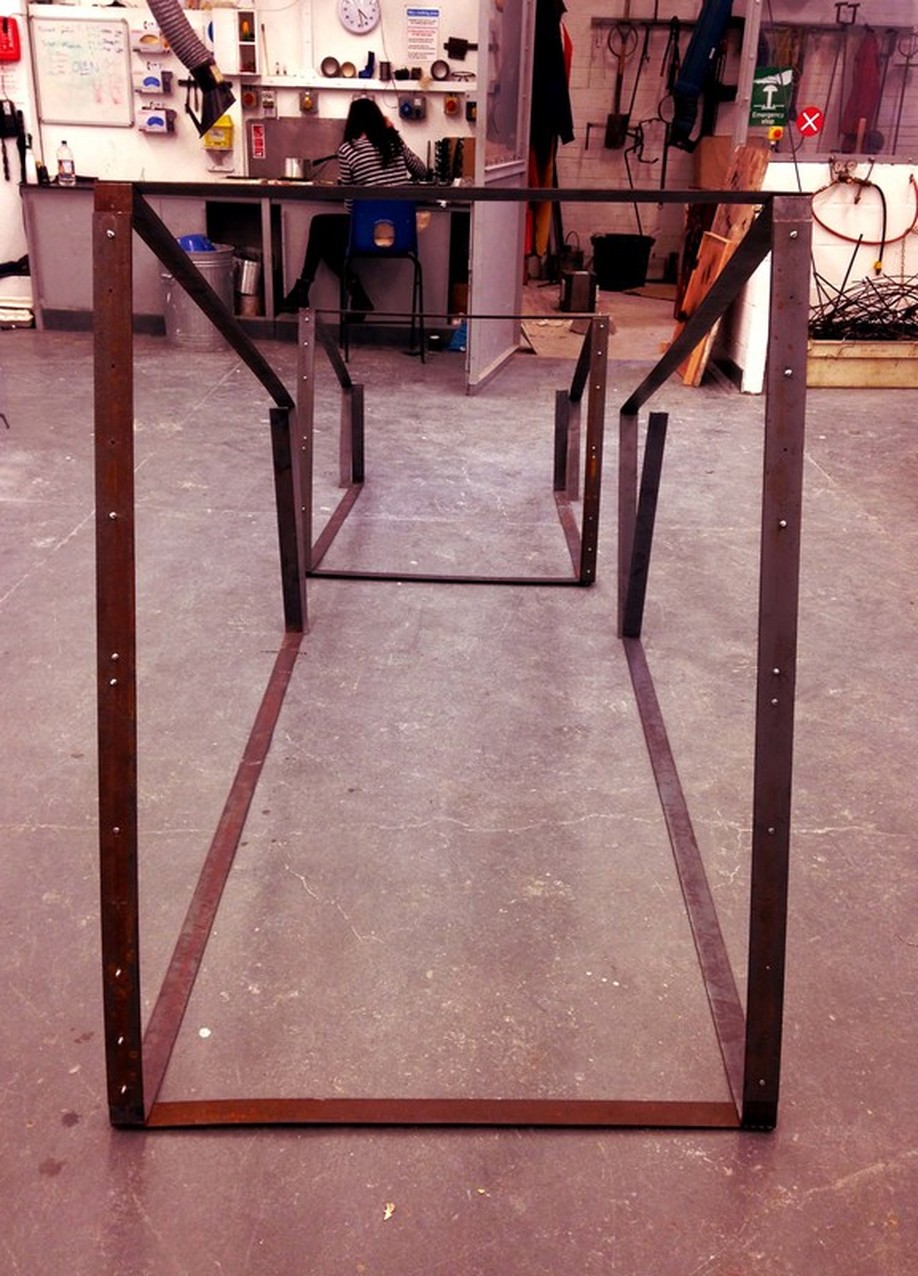
After testing the stability of the structure it was clear it would not be safe in an exhibition space. I have started visualising the way it could look now the structure is being reinforced with a pine frame. Thinking about the spatial positioning in relation to the other objects in the installation.
Rough sketches below.
|
|
|
|
|
|
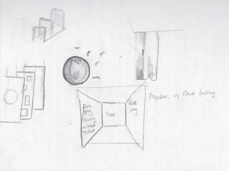
The Concept
This structure is one of the elements to my installation, as well as the poem, the film, and the objects.
I created the structure because I wanted to have limitations and confinements to the piece. The poem is an atmospheric narrative guiding the reader through time by describing the movement of light in an interior space. I wanted to create a minimalist structure which represents space. Space is better communicated when there is something in it, something which you can use as a comparison to the scale and expanse of the space which surrounds and enters it. These are very simple structures made from pine and steel. The transparent fabric allows the audience to see the relationship between the outside and inside of the structure, creating a connection between the expanse of space and the confined space. The fluidity of space inspired my to use transparent fabric, space is everywhere and it has no visible form, the structure gives space a form, and this fabric allows for the transition of space.
What is the relationship between the physical structure and the film?
The structure gives a designed space for the film projection to inhabit. Conceptually, the movement of light can only be seen when it touches objects, forms, and colours. My film is made up of photographs of these objects, forms and colours being effected by the movement of light throughout the course of the day. In the installation, the projection will act in a similar way to the sun on an interior space, touching the structure and objects I have arranged, therefore changing the atmosphere of this created environment. I want to recreate the natural movement of light in a controlled space.
This structure forms a space I can control, I want the outside to effect the inside to a certain extent, but I want to be able to have some control over the space the film would be projected onto, to effectively communicate the atmosphere of the poem to the audience. From my past research into interior design psychology, the confinements of interior spaces allows the designer to have more control over the intended atmosphere, light and colour in a space which is separate from the outside environment means these elements are less affected by outside influence.
|
|
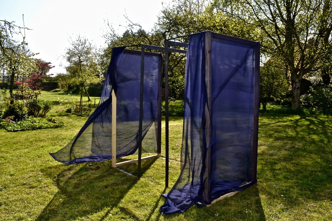
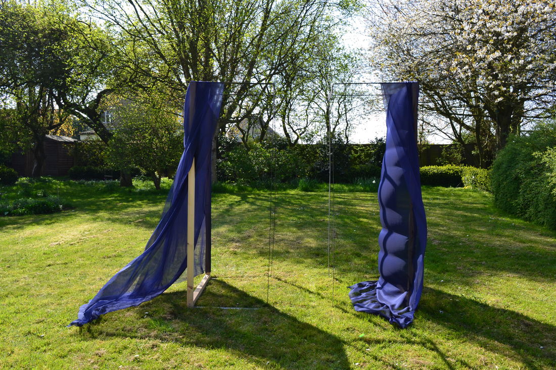
Experimenting with Fabric
Bringing in other elements to the installation. I like the contrast between the harsh texture of the steel and the fluid transparency of the fabric. I am playing with idea of using this installation to symbolise 'space', the steel gives the space a structure whilst the fabric marks the transition between outside and inside.
Connecting the Fabric to the structure
The fabric needed to be as flexible and adaptable as the structure. I didn't want the fabric to be permanently fixed to any of the structures, I wanted it to be a separate element to the design because I want to be able to reuse the materials in the future, I don't want to just leave the installation once the exhibition is over, I like the idea of reusing and recycling in a creative way. I was inspired by Do Huh Suh's exhibition at the Victoria Miro gallery in London. I like the way the fabric almost disguised the structural skeleton underneath, and became the structure. So I decided to sew tunnels with the fabric for the structure to slide into. This way it is easily taken off and it looks neat.
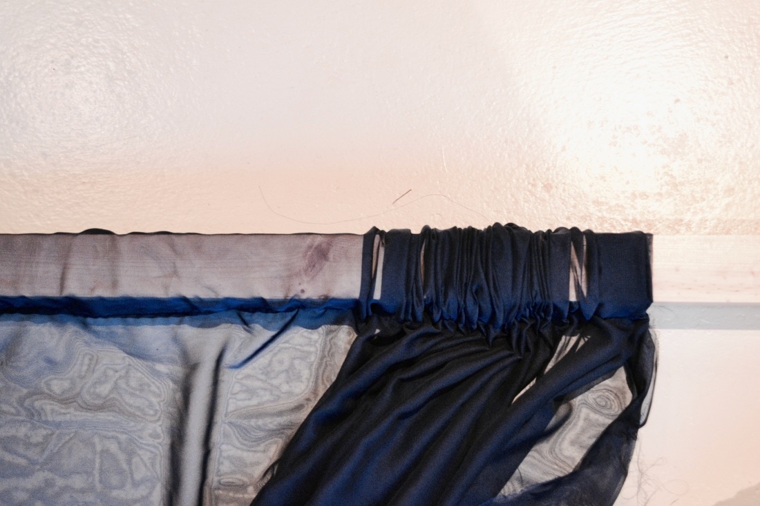
Sewing tunnels in the fabric
It was my first time on a sewing machine and I chose the most challenging fabric. The chiffon was very stretchy and slippery, it constantly moved when trying to pin and hold it, so getting a straight line was nearly impossible but I managed to create a tunnel the right size for the wooden frame to slip into. I wanted the fabric to have some leeway, I didn't want it to be static like the structure, I wanted it to move and appear fluid.
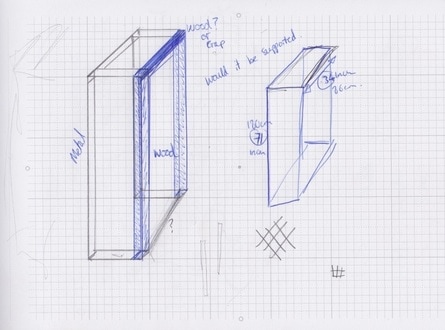
The sketches below are of the wooden frame which supports the steel structure. I wanted to cover this frame completely. These sketches allowed me to work out how and where to sew the fabric.
The Relationship between Light, Texture, and Material
Thinking about the objects and their positioning in relation to the structure.
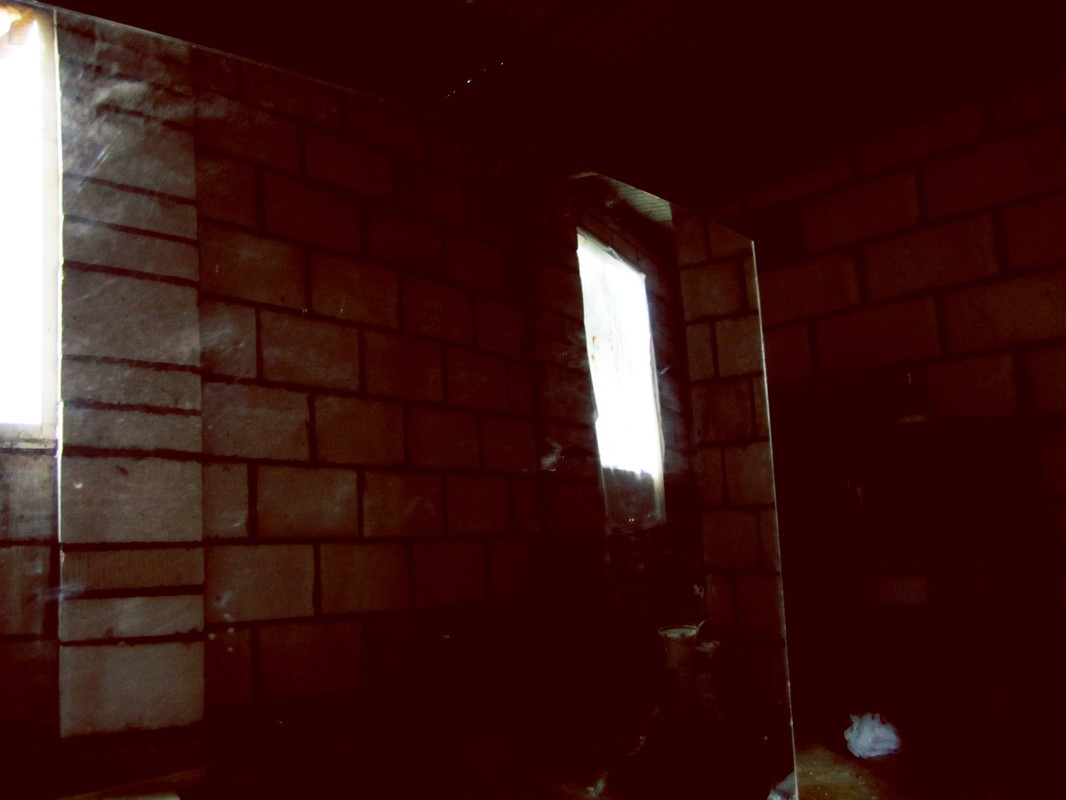
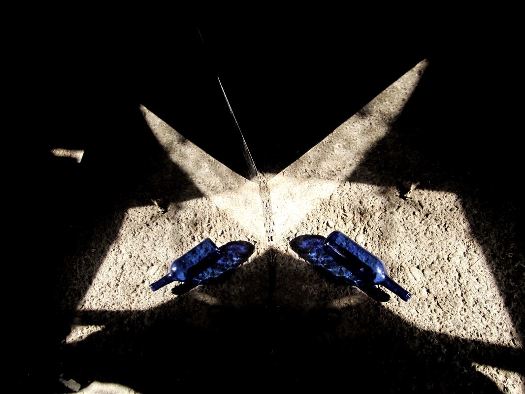
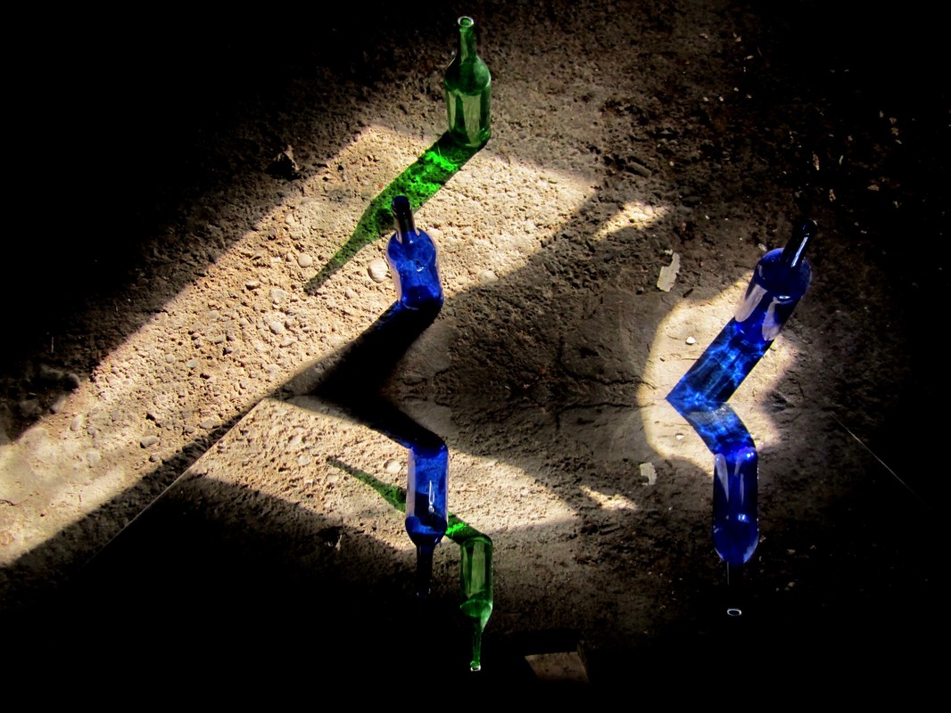
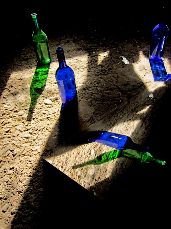
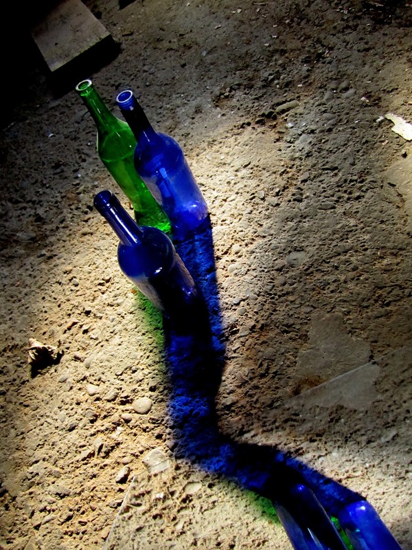
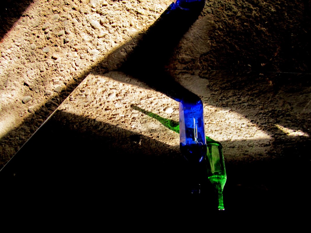
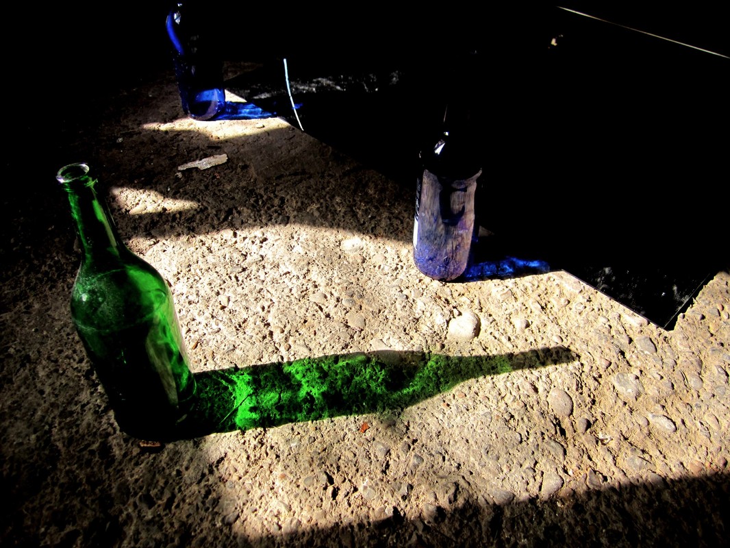
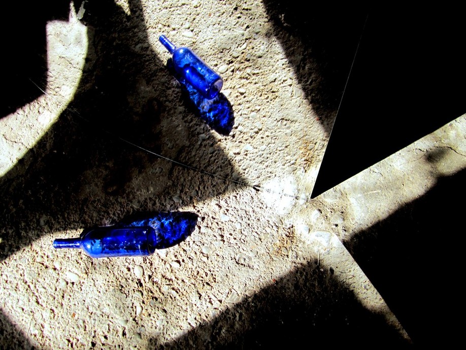
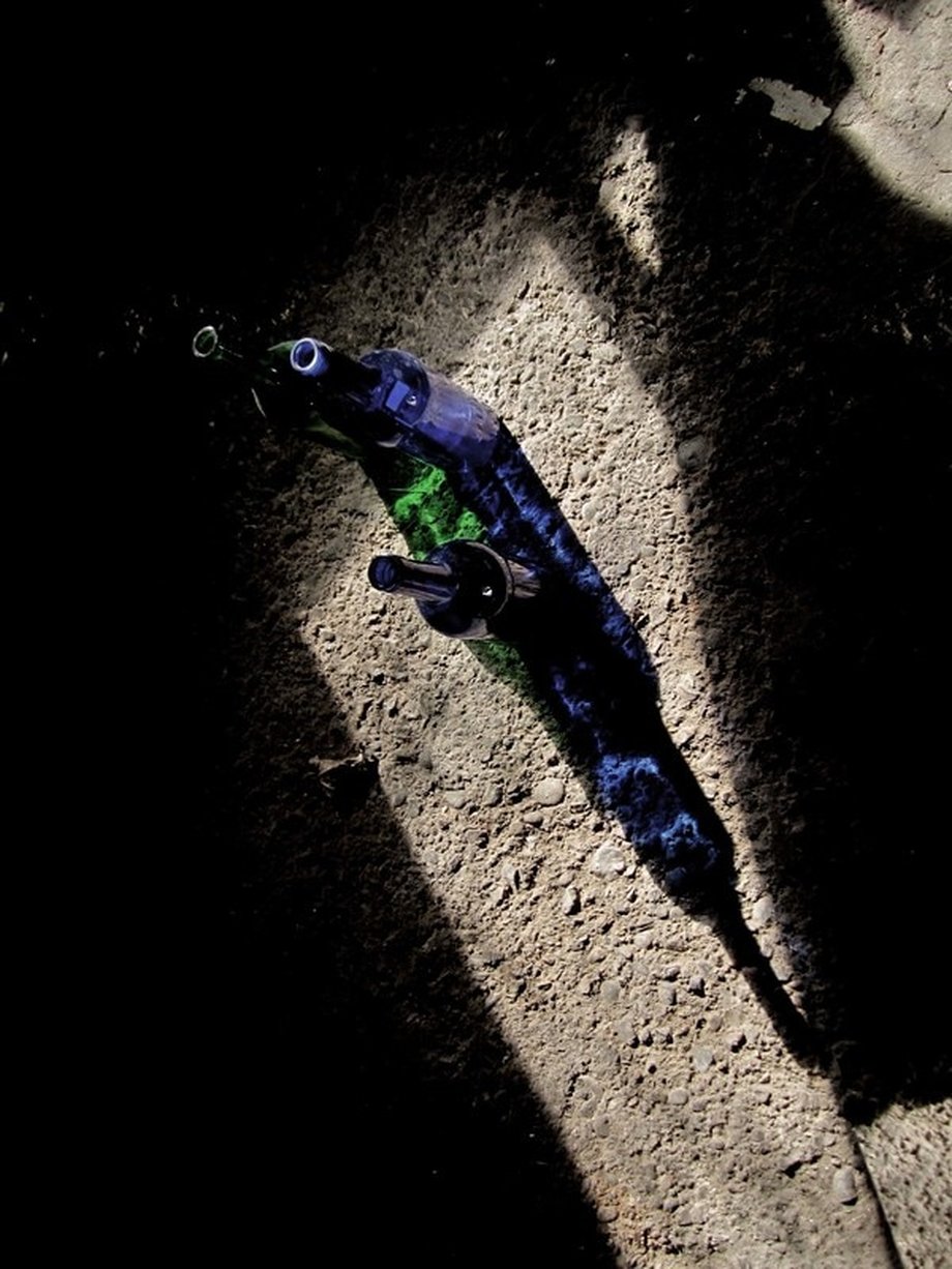
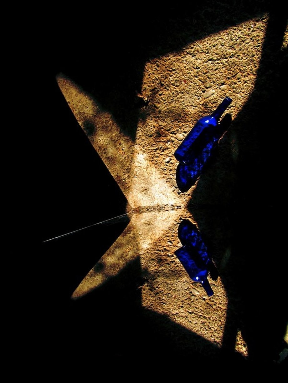
I took my small structure, a mirror, and some glass bottles into my grange to experiment with light and arrangements.
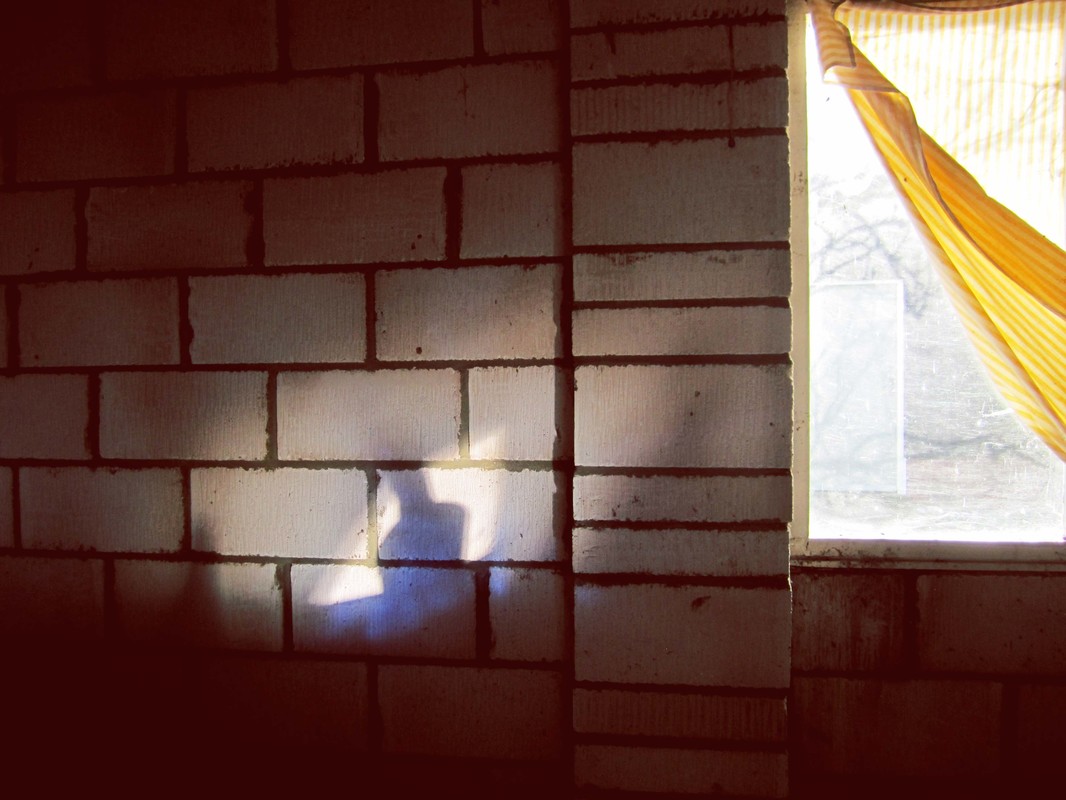
It was a sunny day so the light was pouring in from the window. I began playing with the positions of the bottles and the mirror, the photographic outcomes were really interesting.
'Transparent bottles huddled on the floor, In the sunlight only, I can see right through. In this bright hour I’m awake before, I contemplate that soon this might be you: An empty bottle in the light, consumed,'
- Alice Greenwood Bliss
I have used this poetic text at the beginning of my constructed poem. I find it interesting how she is comparing a person to a bottle. The transparent, empty form is referring to a person, the feeling of being empty, having given everything, or someone has taken everything, and you're stripped to your original form.
I find the symbolic quality of a bottle interesting in relation to my interest in space. I like the idea of an empty container, full of space. The concept of a form which has the ability to contain space. I have translated this idea into the way I illustrate space. The structure I have made is there to represent space, although it isn't a closed form, the structure still identifies the space within it.
These bottles represent more than what the poem implies. They represent the element of space which is key to my area of investigation as an illustrator.
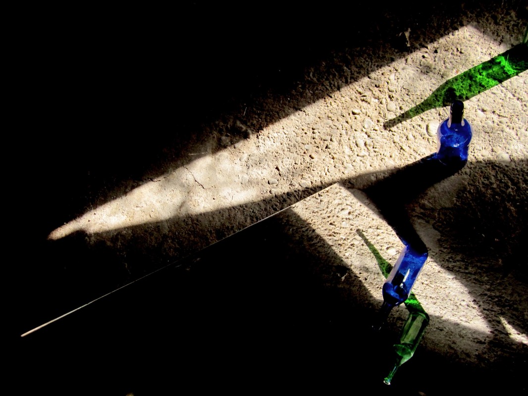
The yellowness of the sunlight kept changing, but the coloured shadows of the bottles was intense and vibrant. I found it interesting how the mirror became invisible, you could only identify the mirror from the line of symmetry.
|
|
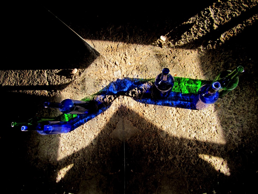
The rough, uneven texture of the ground enhances the ethereal quality of light passing through glass. This shows the effectiveness of surface and texture when illustrating the concept of space and it's identity.
Edited Installation Design
I have experimented with the structure of the design, the fabric and the projected film in relation to these elements. I have decided not to use the smaller structure because it looks to cluttered with the larger structure. I also want a simplified design.
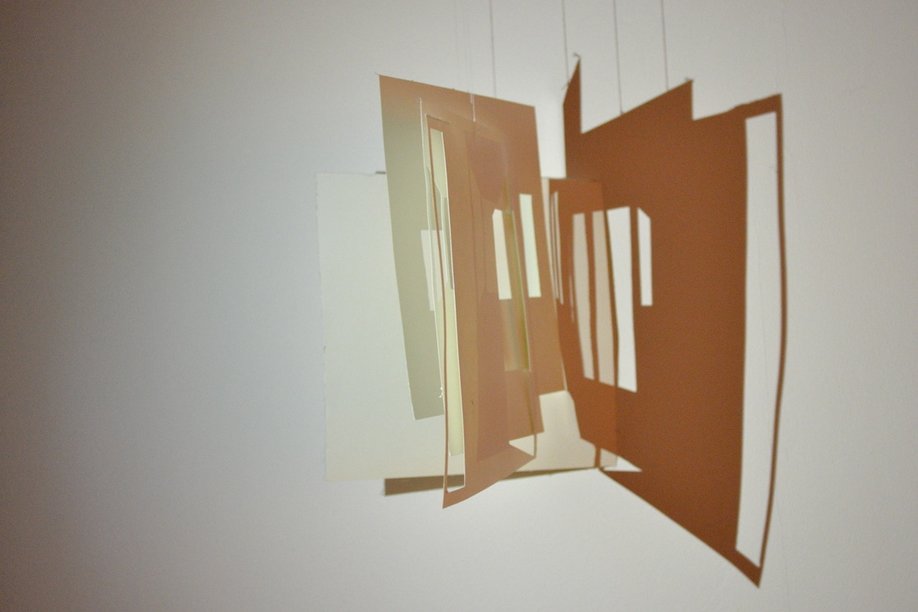
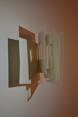
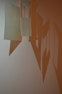
I have designed some perspex shapes which will be hung above the installation to play with the light from the projection. The perspex forms are inspired by the shape of a bottle. As described in the poem 'Transparent bottles huddled on the floor, in the sunlight only I can see right through...'
I am still unsure as to whether I will be using the bottles as well as the perspex. This is something I will experiment with once I have the space to set up the installation and projection.
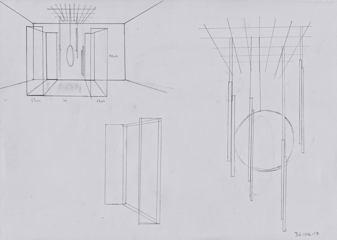
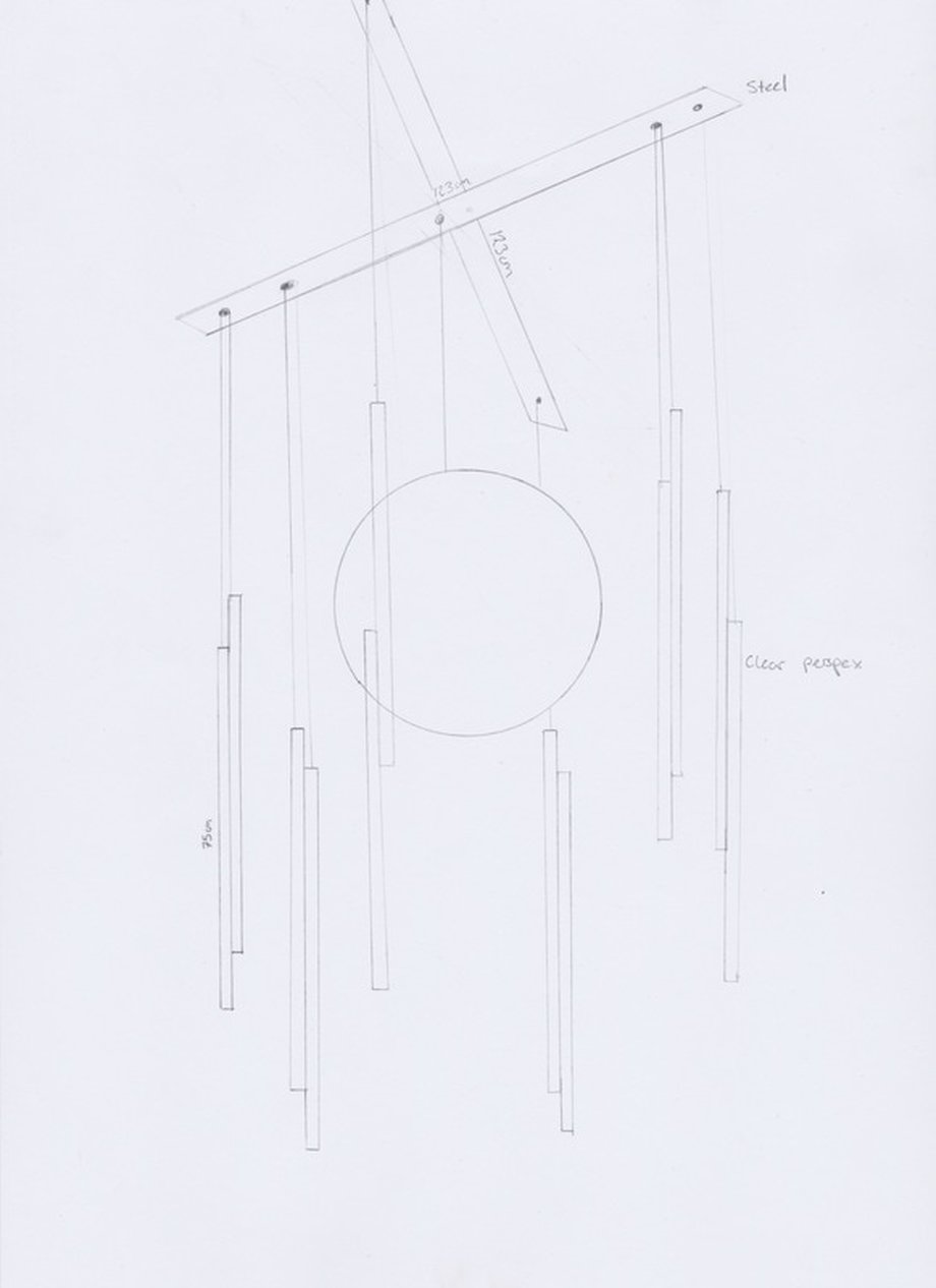
Ideas for hanging perspex
Thinking about shapes and forms which could be drawn out of the form of a bottle. Lines and circles.
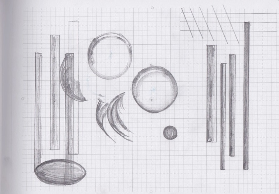
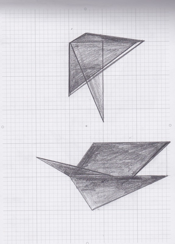
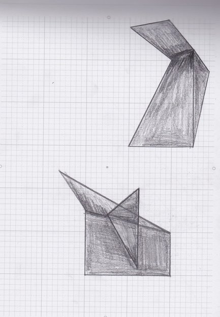
I am also trying out some ideas for perspex objects. These shapes and forms are drawn out of the earlier architectural collages I produced. I think it would be interesting to see how perspex objects would play with the light from the projection.
|
|
I have redesigned the way I will hang the perspex shapes. I have two spare pieces of steel which were originally used to support my installation, but I have decided the installation looks more refined and simplistic without them. The metal grid from the junk yard I was originally going to use is very bold and obvious, I have decided to use the steel instead because it is more subtle and consistent with the materials used in the current structure. I think using too many materials can look unplanned and cluttered, I am inspired by minimalistic design.
I am unsure as to whether I will be using this many perspex strips, I will be testing it out this week with the projected film.
I am unsure as to whether I will be using this many perspex strips, I will be testing it out this week with the projected film.