The Experience
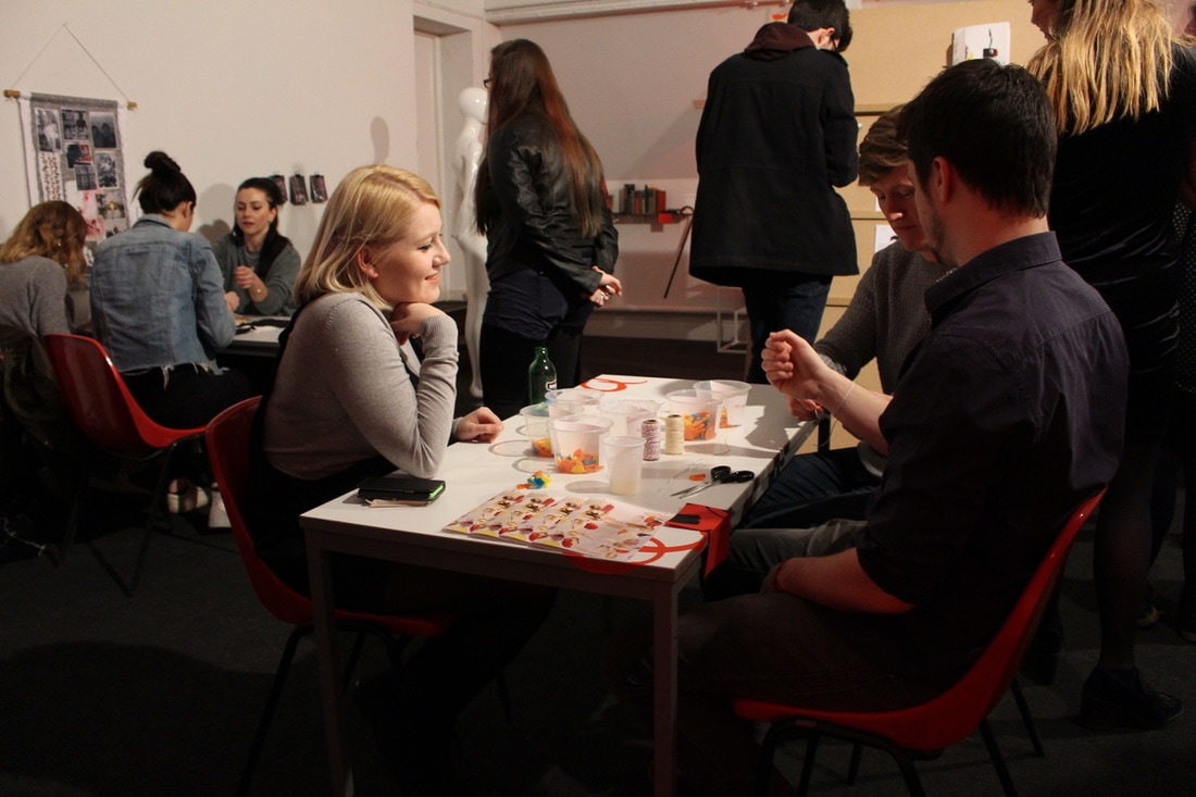
This was a fun and exciting few weeks. Having the responsibility to create an exhibition space was such a new experience, we were thrown straight into it, the pressures and challenges which this incredible experience came with have taught me a lot. Within the curation team we have all developed a really strong and positive relationship with each other. This opportunity gave us as young creatives a really chance to show everyone and ourselves what we can achieve, gaining a knowledgeable insight into the world of curation and event planning, hopefully putting us in a strong place for the design of the degree show.
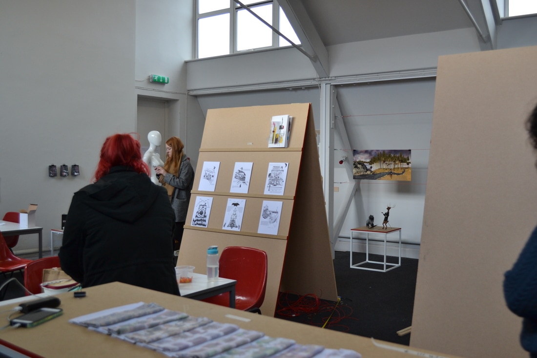
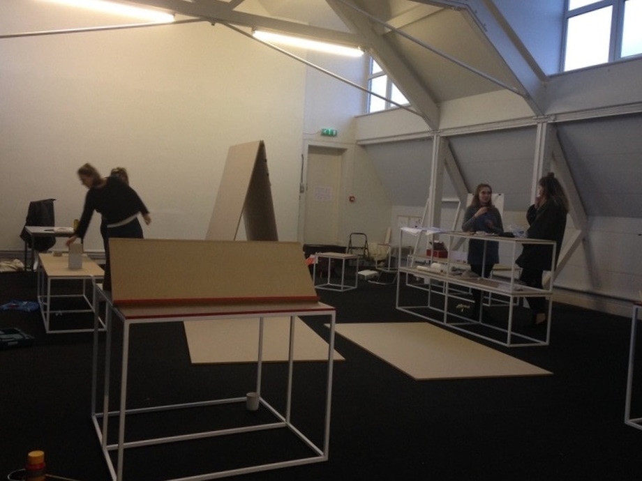
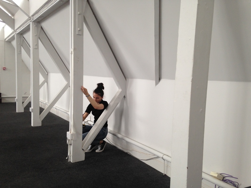
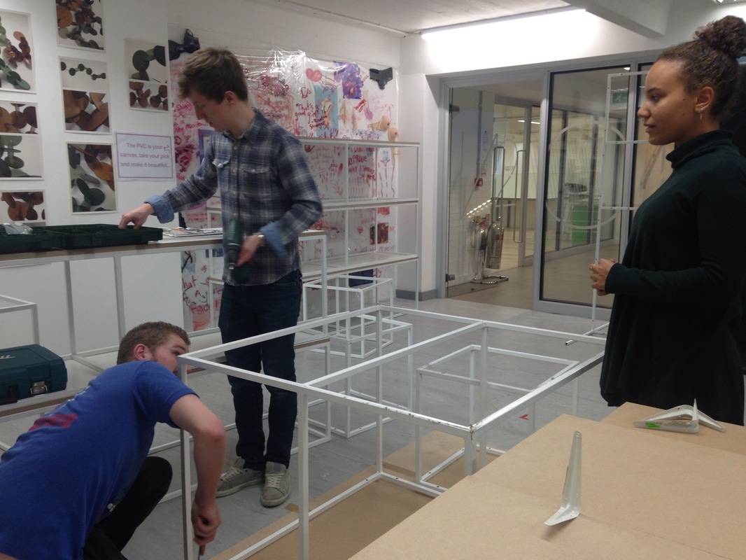
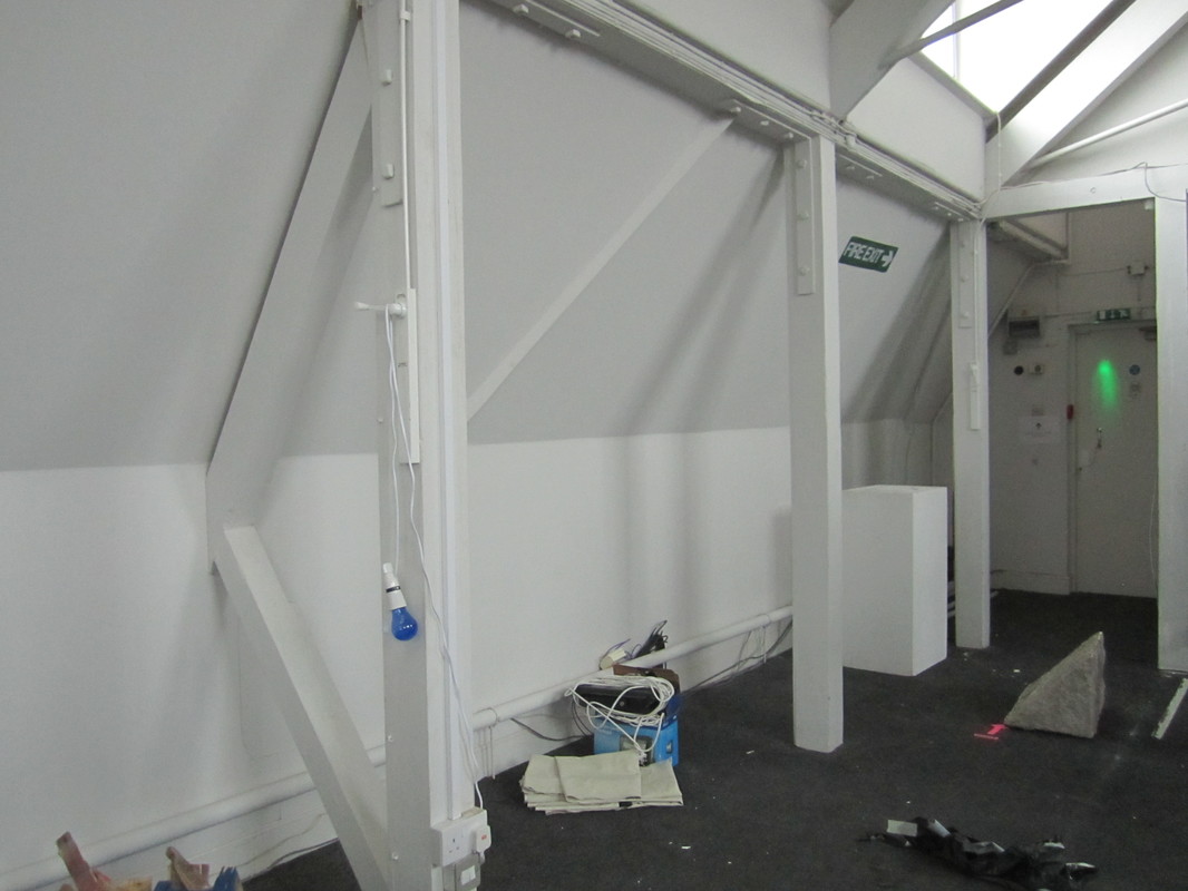
I was involved in the 3D design and spatial planning of the exhibition. Electra, Saph and I were able to use our skills in the 3D workshop to create new display systems. The time limit did affect the diversity of design and materials we could use, however this made it easier to make decisions. We knew we had to think and act fast, and also come up with an innovative design which enhanced the appearance and approachability of the amazing work displayed.
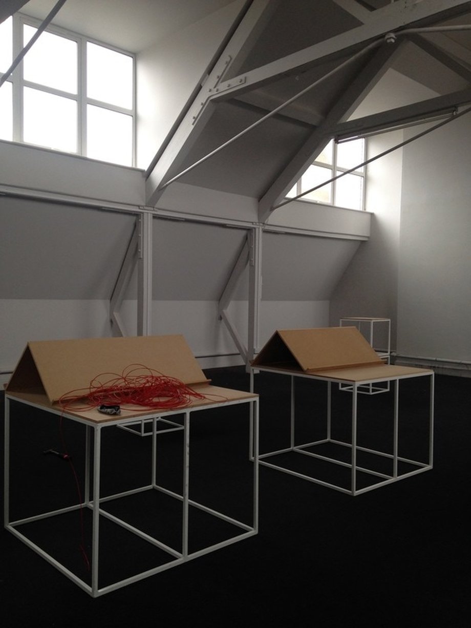
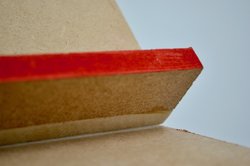
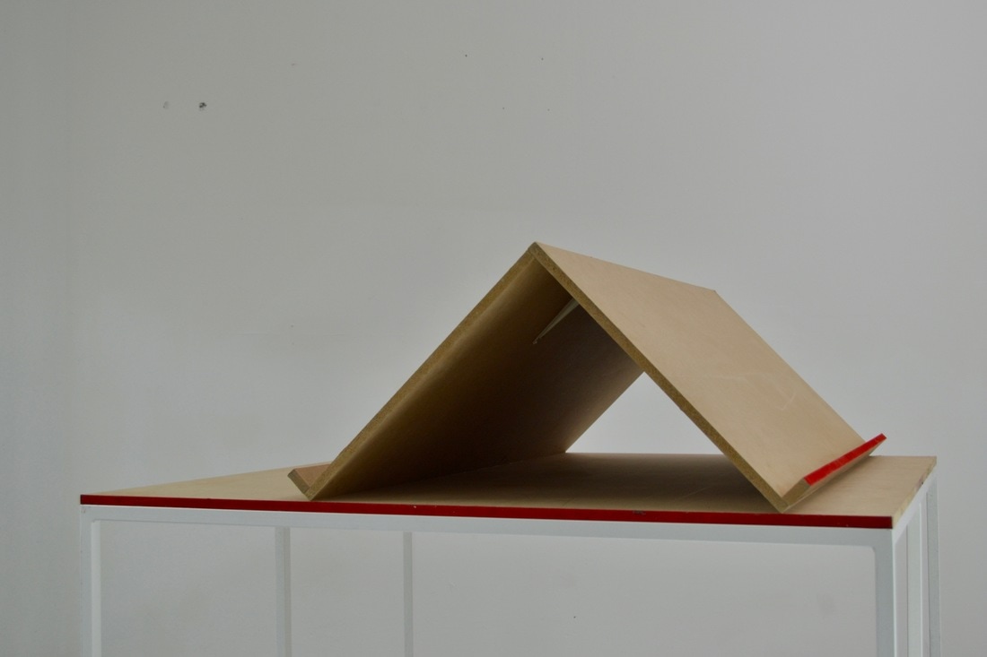
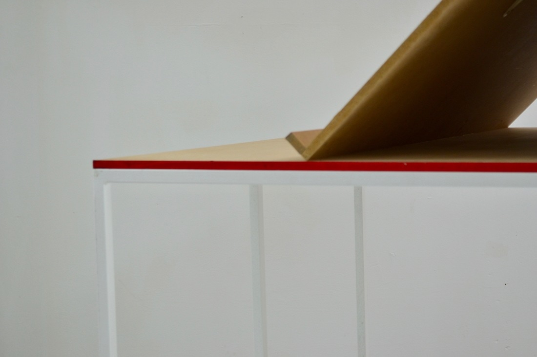
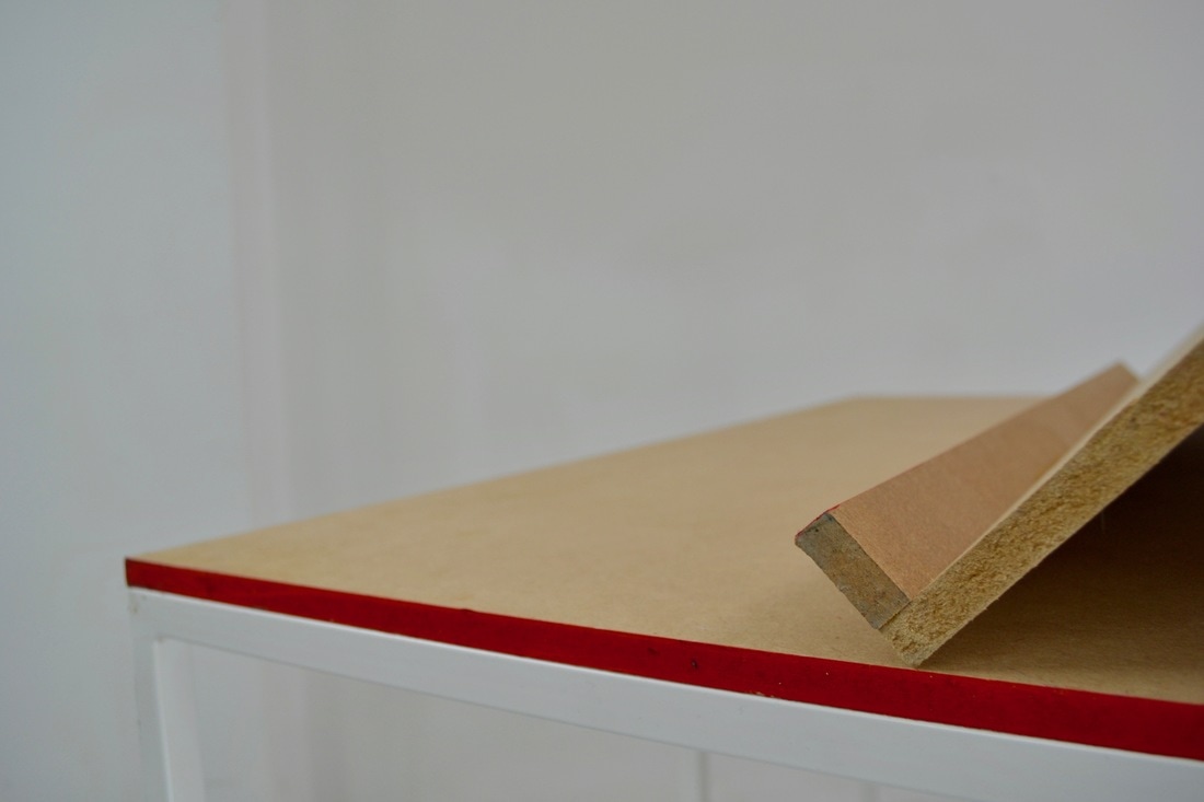
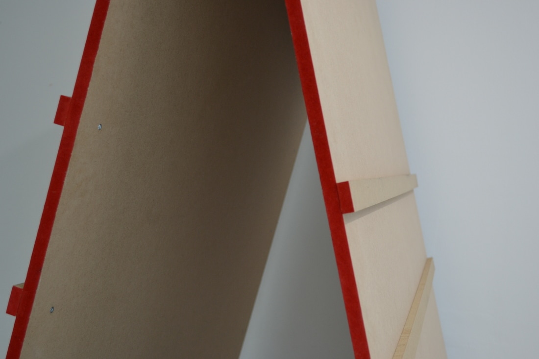
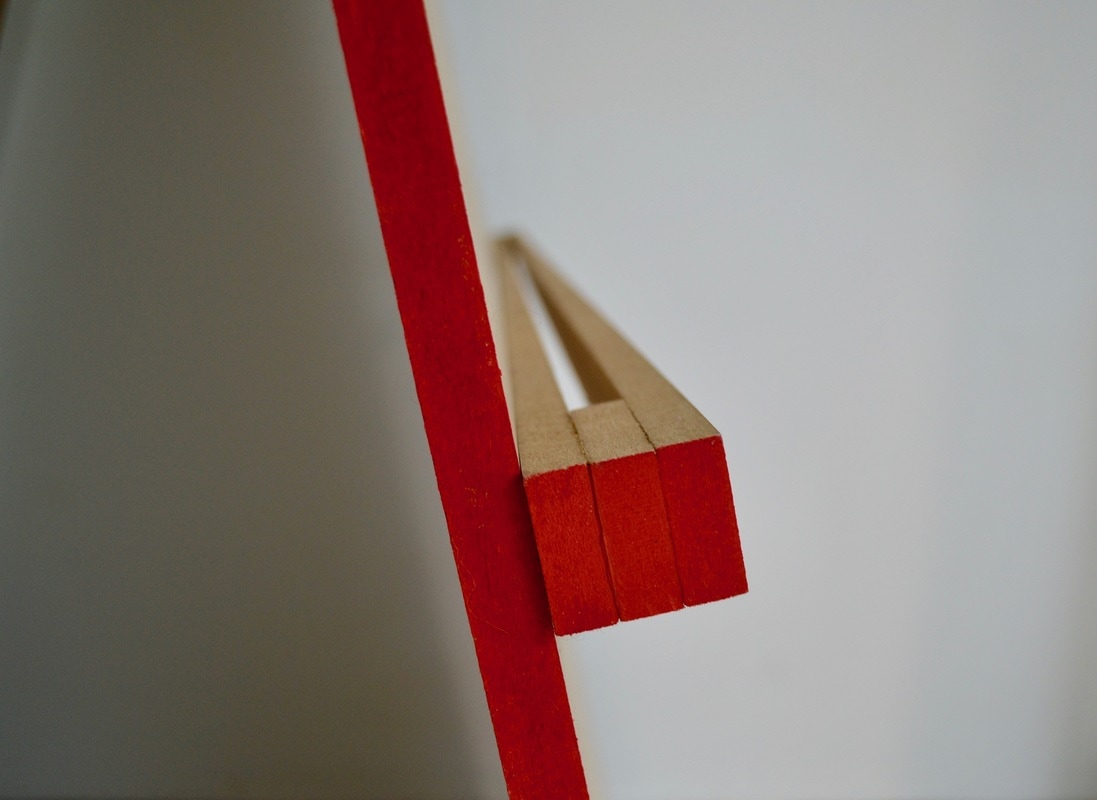
We decided to use the white frame display systems already existing in the studio as they allow us to be flexible in design, and also take the pressure off creating structures which safely stand and function in a public space. We resurfaced all the white frames in MDF. We chose this material because it had a low cost, and we wanted to add a raw aesthetic to the space, the exhibition was about the joining of people, practices and creative outcomes. The raw slate we started with as collaborators is represented in the raw appearance of MDF. MDF was also a softer material, therefore easy to drill into and create exciting forms with.
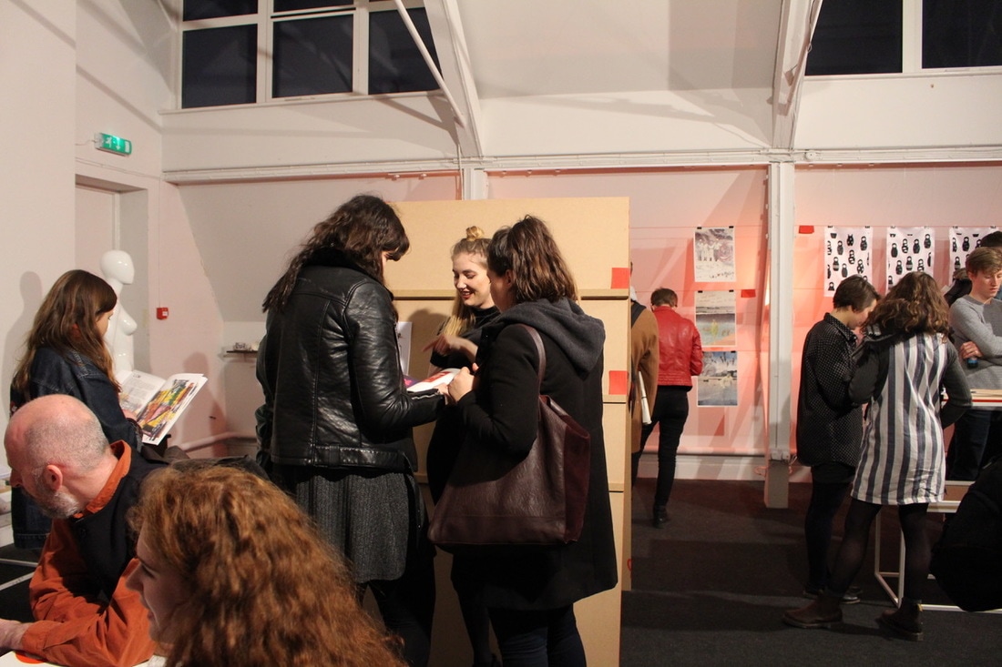
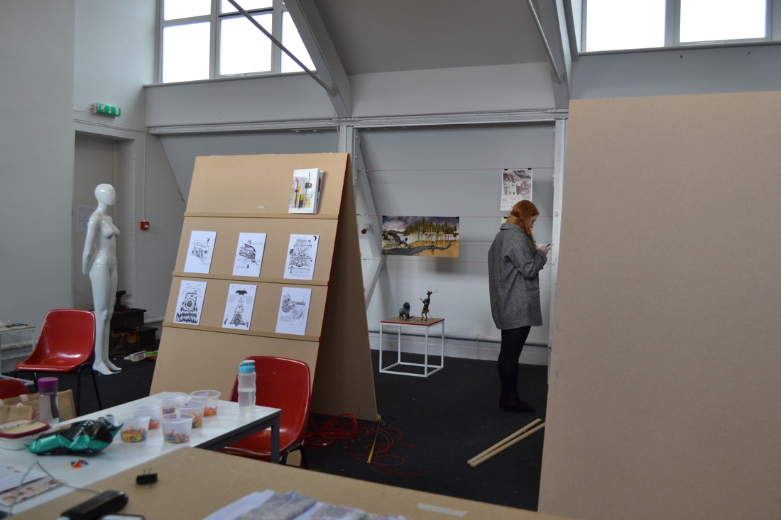
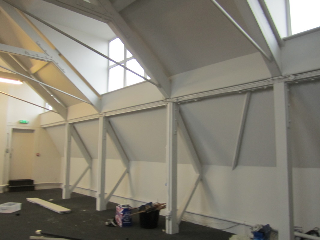
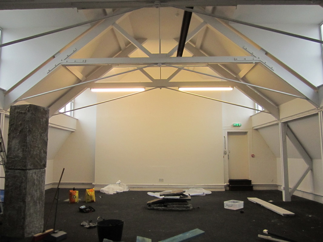
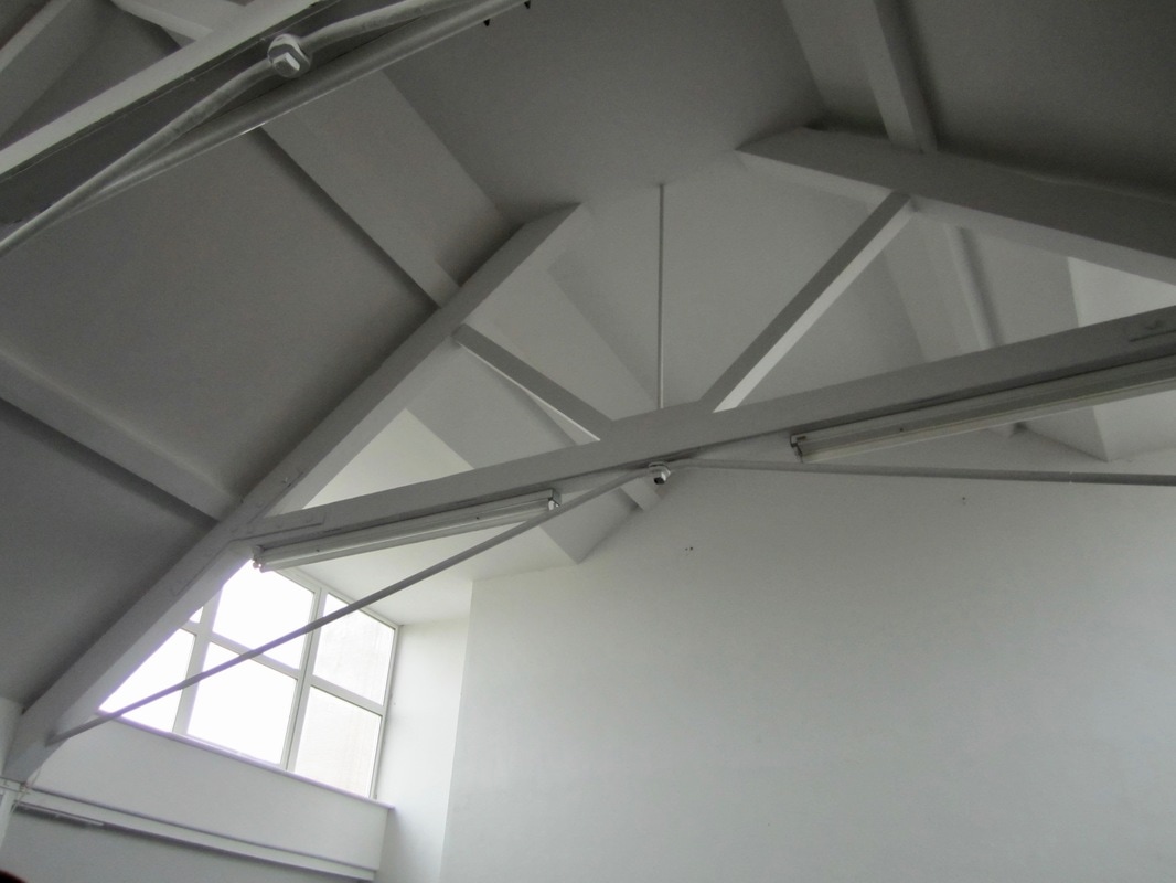
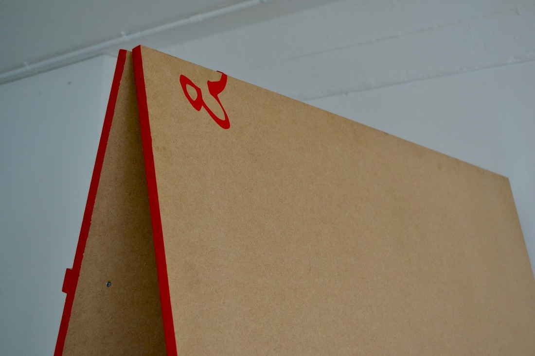
The triangular form of the display structures is coherent with the triangular ceiling of the space on Dove Street. It was clear when we saw the space we should be playing with the height of our designs, flat surfaces don't take full advantage of the space. We came up with two triangular forms, both were adaptable in what they could display in terms of scale, size, quantity. As we didn't have the proposals at the time of designing it was important that the designs could adapt to what work we got, not the other way around. For example, photographed below is the double shelf on the A board, made for publications which may want to be displayed open. We also wanted to create display systems which were coherent with the designs from the graphics team. The 'A' of ampersand was an important symbol which played a part across the holistic design, for example the A boards.
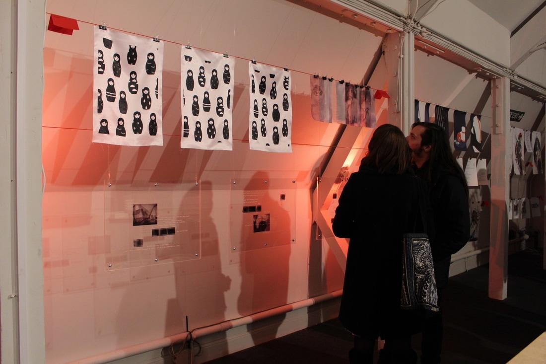
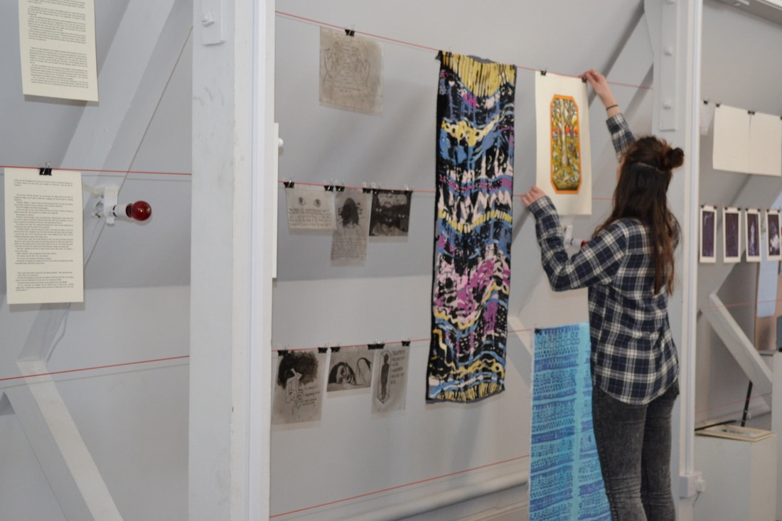
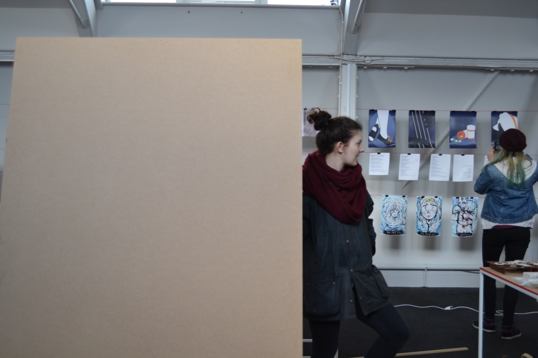
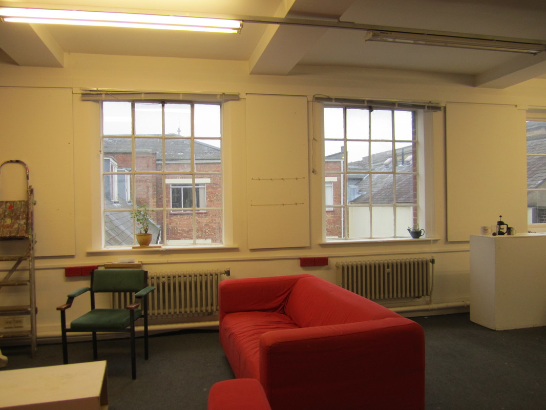
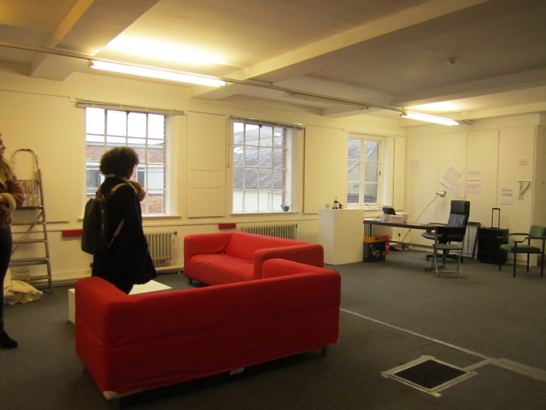
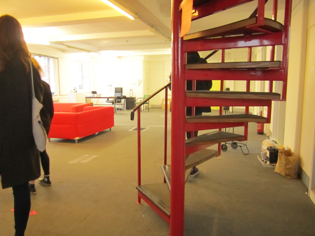
The red detail within the space was another coherent design element. There is red detail on the original space, red plug sockets, red stairs, red sofas. These pieces stood out to us, so rather than trying to hide them, we embraced and enhanced them. The colour became significant to the identity of the exhibition.
Critical Outlook on the Curation
A few things that could be improved from a critical eye:
- The lighting - I felt the red light bulbs didn't show off the work, they changed the atmosphere of the space, making the exhibition less about the work we were exhibiting and more about the space. In the future I think lighting is a significant element to be considered at the same time as creating the display systems.
- The red cord - I felt like some people were disappointed to hang their piece of a red line with bull clips, it make the work shown appear as work in progress, rather than showing it off as the finished piece. I think the work might have looked better if it had a surface closer to the hanging pieces, to give it a contrasting material so the audiences eyes are more focused on the piece rather than the space behind.
- The A line boards to up too much space, they were too dominant. Being tall and wide was too much for the space, I think thinner, tall shaves would have been easier to move around. Also the middle of the A board is a waste of space, they could have had shelves at the side so people were encouraged to walk around the board.
Overall it was a great experience. I learnt how to work with people, the importance of delegation and working with everyone (graphic, social media, curation) to create a coherency, and also how to utilise a space to it's best ability. Now when I approach the design of a space, I will look at and understand more the original shell of the space and it's importance in influencing the design of the interior. The ability to understand the space is necessary in creating an effective, functional and beautiful design.
Sophie Dumay
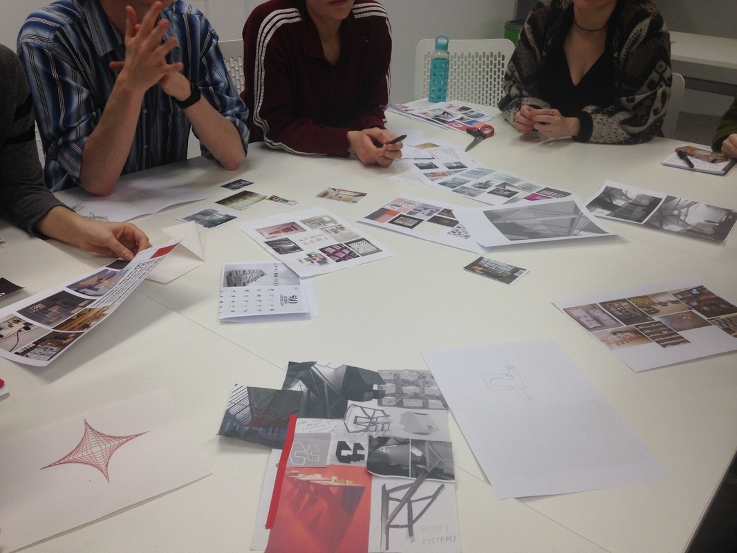
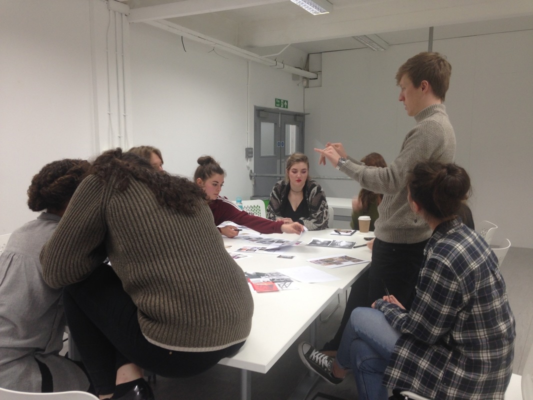
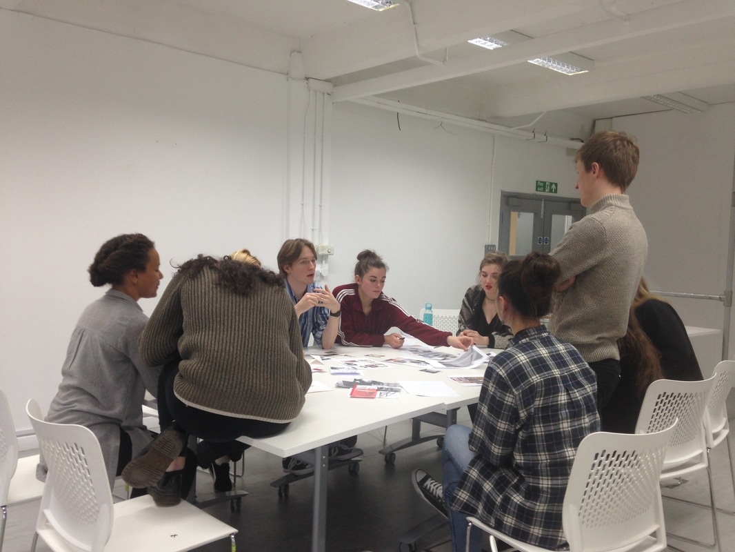
It was really interesting to meet Sophie and learn about the way she approaches curation.
During our curation group meeting with Sophie about the degree show she raised questions such as:
Are we exhibiting as a collective?
Are we exhibiting as separate groups within the year group? How could you separate these groups? Format, medium?
Could we have a room for a reel of films, a reading corner, and a space for workshops?
How is the audience guided around the exhibition? Is there more than one way round the exhibition? How can we create a narrative/narrate through the exhibition?
Can we create adaptable display systems which can be used for different functions/purposes? Would it help to give our year group limitations, restrictions, scale in order to create consistency within the exhibition space?