|
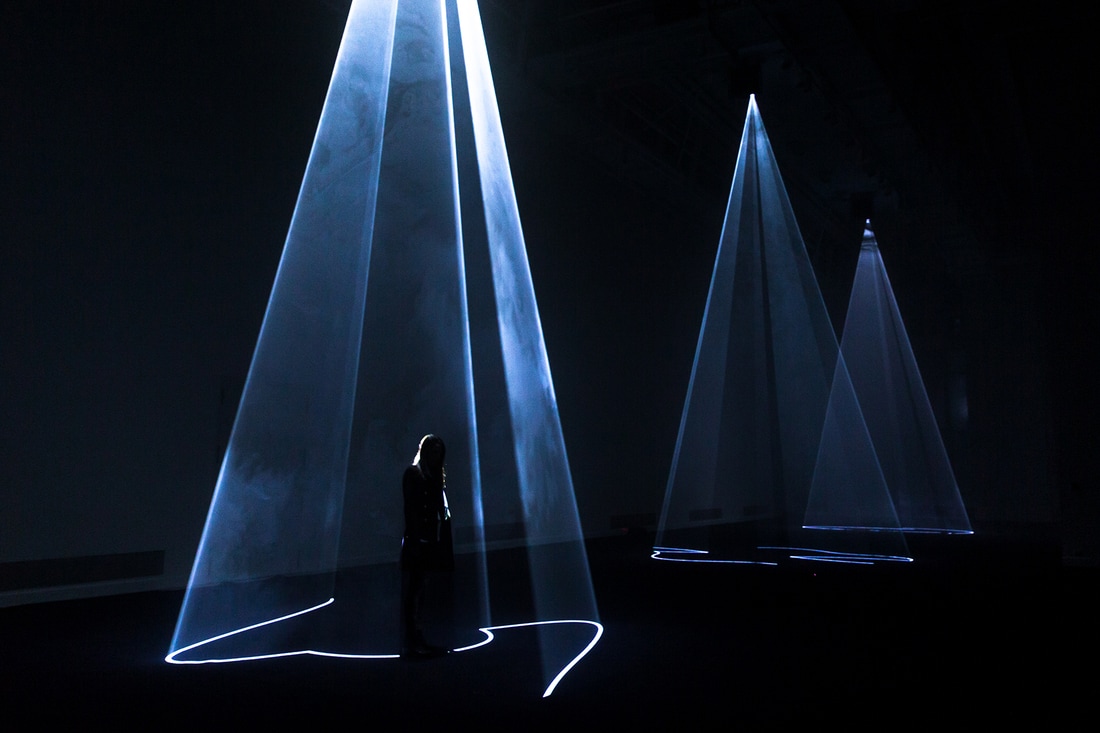
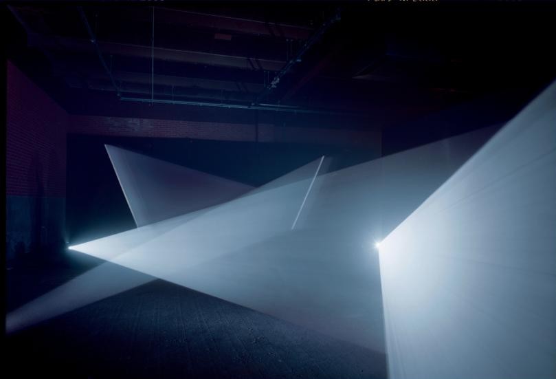
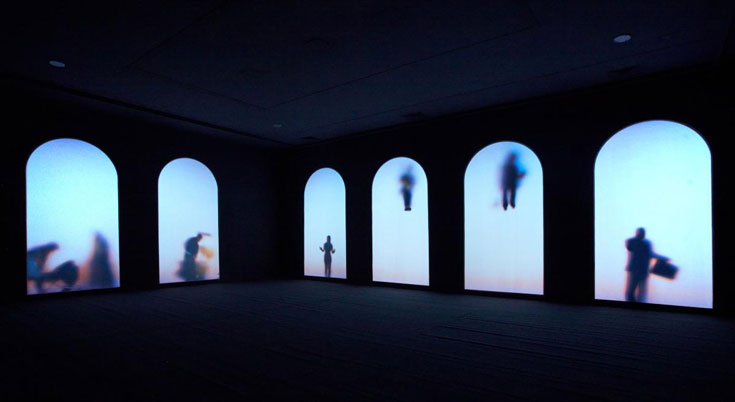
These are images from the portfolios of Olafur Eliasson, Tacita Dean, James Turrell, and Donald Judd. All these artists inspire my for different reasons, however, when I look at there work collectively, I see mutual elements which define their practice. I continue to be fascinated by the concept of Biophilic Architecture (as deeply researched through Ba3a) and how it can be practiced in the built environment to improve our wellbeing and happiness. Biophilic architecture is the act of creating environments which incorporate elements of nature into the design. Being in an environment inspired by nature either through colour, texture, spatial positioning, light etc has a healing, restorative influence on people, and it can improve our quality of life. I have been applying these theories to the way I design. For example, my current installation incorporates the spatial positioning and forms of nature. The hanging perspex representing the sun, the green bottles on the floor are inspired by woodland, the bottles symbolising trees, and the hanging strips of perspex could symbolise rain or the direction of light. I want to test the affect of an environment closely inspired by nature on an audience. I hope that the visual similarities in my installation in comparison to nature encourage the audience to feel calm, and also allow them to make the connections naturally. The images below are examples of other artists who look at the environment and nature, incorporating it into built spaces or creating built designs which are coherent within the natural environment. All of these images demonstrate the use of biophilic design, using nature to enhance the purpose of the space which is to be calm and experience the act of nature as an art form, like Eliasson's manmade sunset. The natural environment is innate in human biology, we have a deep connection rooted in nature, it's something we all share, and whilst the built environment can sometimes make the accessibility to nature harder, the act of innovating nature into the built environment can bring this back, improving the holistic wellbeing of its inhabitants. 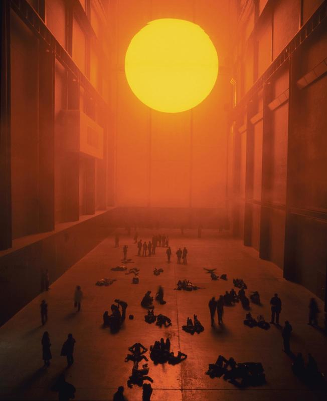      Tacita Dean projects stills of the natural environment (like the pink dusk sunset above) onto inside spaces. She believes we rush around too much, trying to do too much, we need to stop, to slow down, to look at what's around us. Her stills represent the moment of still we should be taking in our everyday lives. It was interesting to read about her in the article below on 'The Blogazine'. 'Her endless pauses on almost still bucolic overviews, atmospheric events, expanses of water and skylines work as a kind of training to get eyes more accustomed to calm and patience: slow and lengthened pedagogical exercises that help us to linger on details, appreciate the time expansion and repossess our contemplative aptitude, because on the contrary of mass belief, “not doing” is an active practice where new ways of thinking and creating actually lie.' - Monica Lombardi
0 Comments
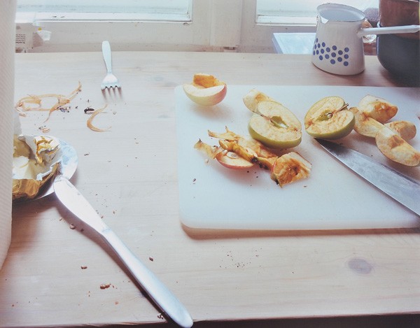
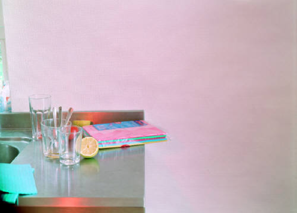
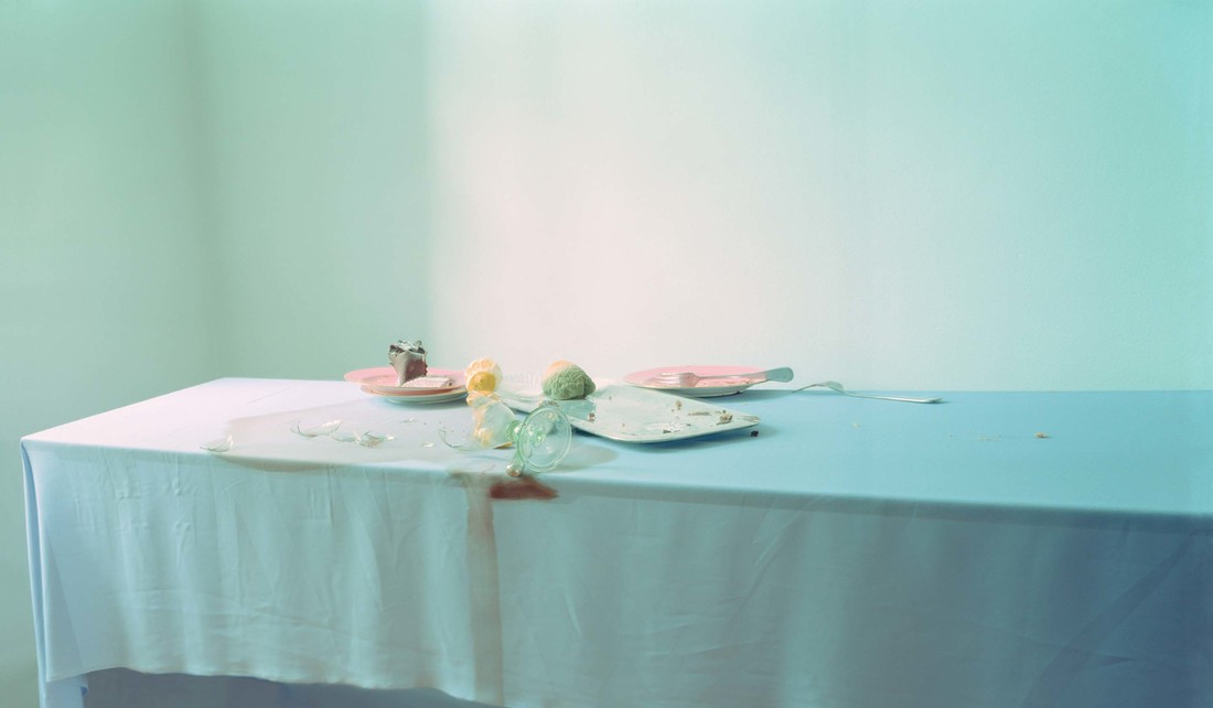
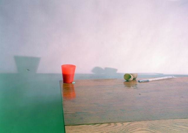
Daniel Libeskind is a Polish-American architect, artist, professor and set designer. I am fascinating in the way Libeskind translates his concepts into the design of functional, architectural spaces. For example, as described the clock below illustrates the concept that time cannot be represented in a specific form, time has no form, it cannot be defined in the order and formalised structure we use to identify it. This concept is not only illustrated through the design of objects such as the clock, but also through buildings such as The Royal Ontario Museum. We can't define space in the same way we can't define time. This abstract terms are entities of abstract concepts and natural occurrences. The way he creates a building which challenges the 'normal' form of buildings we are used to really makes the audience question the order and formalisation of society, and how we categorise these abstract terms in such an unnatural, uncurious way. The way he illustrates these concepts makes me think about my practice, and the way I identify and illustrate space and time. Space and time are both concepts which I have been exploring through film, materials and installation. I still can't define space, my installation acts as a way for people to understand space as a physical, materialistic element. However, after reading Libeskind's theories and philosophies, I now question the way I have illustrated space, do illustrators use symbols an audience would understand rather than question? What is our purpose as an illustrator? I think illustrators should innovate and test what we use to define concepts in order to spark questioning and curiosity of our perception of the world. I have illustrated time through the imagery of the movement of natural light in an enclosed space. The was I have done this has no confinements or limitations, you can see time passing without trying to define it. That is the power of illustration, coming to a mutual level of understanding with your audience, speaking through visuals. 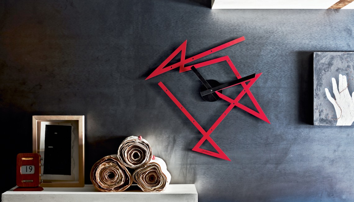 TIME MAZE CLOCK, Alessi “Time is not circular: it veers sharply to mark the event as unexpected—As the clock itself.” —Daniel Libeskind Daniel Libeskind’s Time Maze clock for Alessi seemingly defies the notion of time altogether: time is not linear; it is not circular; time is a labyrinth of abstract connections and playful interactions. To underline this concept the clock can be hung in any orientation allowing for a customized hanging in each home. The Time Maze clock is constructed of stainless steel and comes in red, black and stainless versions. Libeskind’s deep interest in the concept of time is reflected in some of his most iconic buildings. The Royal Ontario Museum 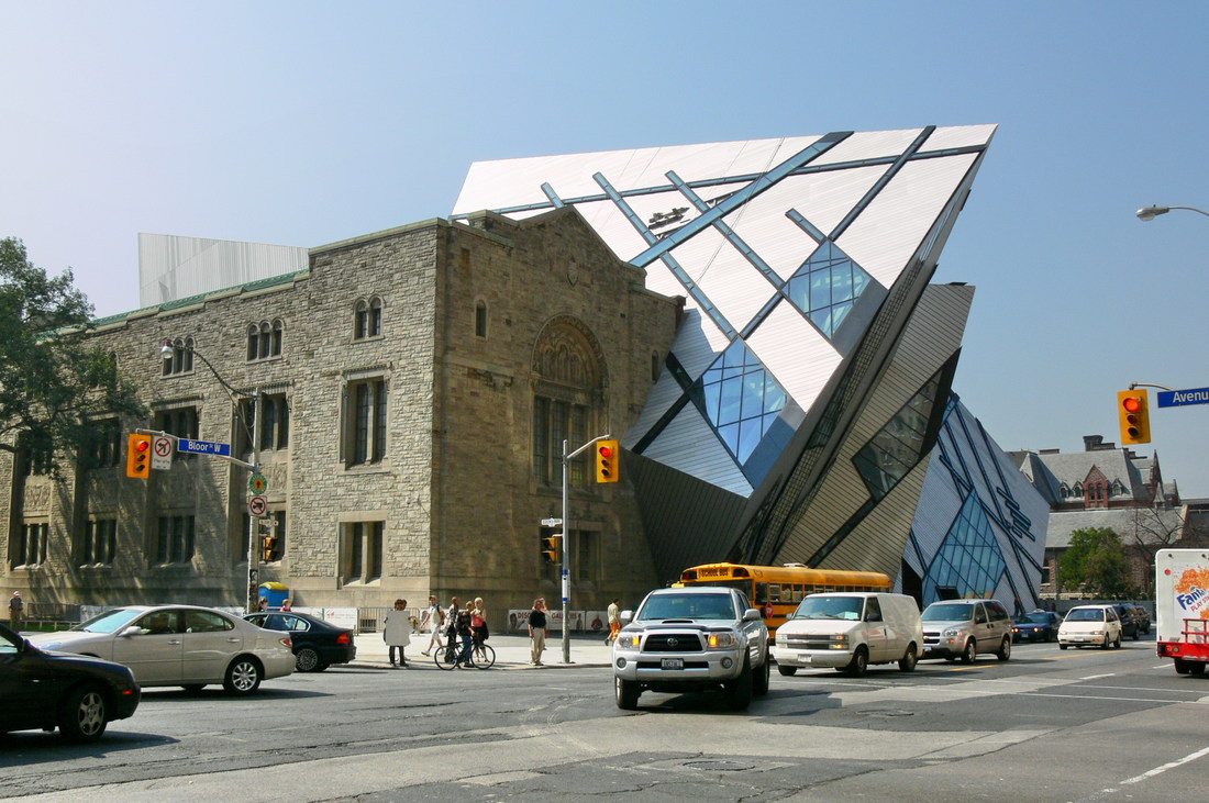 THE WEDGE, do ut do 2014 Design for Hospice The Wedge by Daniel Libeskind, a sculpture designed for the do ut do Hospice exhibition, is a representation of the metaphysics of space. It poses the question: is space tangible if infinite, or a finite dream? Through the disjuncture between positive and negative spaces, The Wedge is an homage to the tradition of Italian sculpture which challenges the weight and solidity of marble with the malleability of pure Form. The cube out of which the wedge is cut could be seen as the Euclidean, whereas the wedge itself is the Modern. As Frank Lloyd Wright said, the wedge is the strongest form in architecture.  This sculpture and the way Labeskind talks about it is again, really inspiring to me. To illustrate space do you need to contain it, contain the nothingness which we can recognise as space, showing the absence of something? This is similar to the structures I have created for my installation, two minimalistic structures which appear to be disjointed, unattached, we try an fill in the gap to the structure, it not physically being there shows us that what is left is space. Absence defines space. I am testing our perception of space using materials such as a mirror, its surface holds the ability to contain whatever it sees and push it down into an illusion of space. 'considered one of Denmark's most influential 20th-century furniture and interior designers' I find it interesting to analyse interior spaces, looking at all the elements which work together to form an environment for a specific function. These two interiors below designed by Verner Panton are constructed in a way that forms almost an art form, the colours are bold and vibrant, the shapes on the ceilings are very decorative and surreal. I like how he incorporates forms into the interior which don't appear very functional, for example, the standing circle in the image below, and the stairs which lead to know where being used as a shelf. I like his play with scale, he increases the size of decorative objects which would normally be sitting on a display table. This results in a surreal environment, unfamiliar and unreliable to the design our mundane built environment. His interior have shown me how my installations have the potential to form interior spaces. The elements I create such as the light boxes, the mirrors, the hanging perspex, all these elements can be translated into the design of a space by playing with scale and purpose.    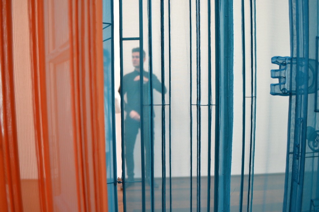 “I see life as a passageway, with no fixed beginning or destination,” says Suh. “We tend to focus on the destination all the time and forget about the in-between spaces. But without these mundane spaces that nobody really pays attention to, these grey areas, one cannot get from point a to point b.” Suh's installation feels very closely related to the concepts which I have been exploring in my current practice. For example, he talks about the importance of mundane spaces and how they should not be over looked. He also talks about the installation representing shifts of psychological state, each coloured section representing the changing surrounds which we occupy. I find it interesting how there is no destination, you can walk through either direction, and it's the journey that is significant. His focus on detail draws you into the environment your in, giving delicacy and beauty through representation of everyday objects and signs. Seeing Suh's work showed me how my practice can be utilised in the wider world, and how it can appeal to large audiences. For example, creating environments to visually and experientially communicate current global issues such as migration and identity, which is what this installation aimed to illustrate. 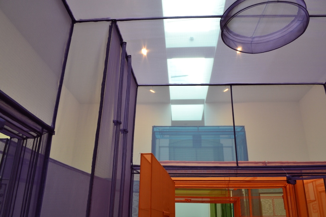 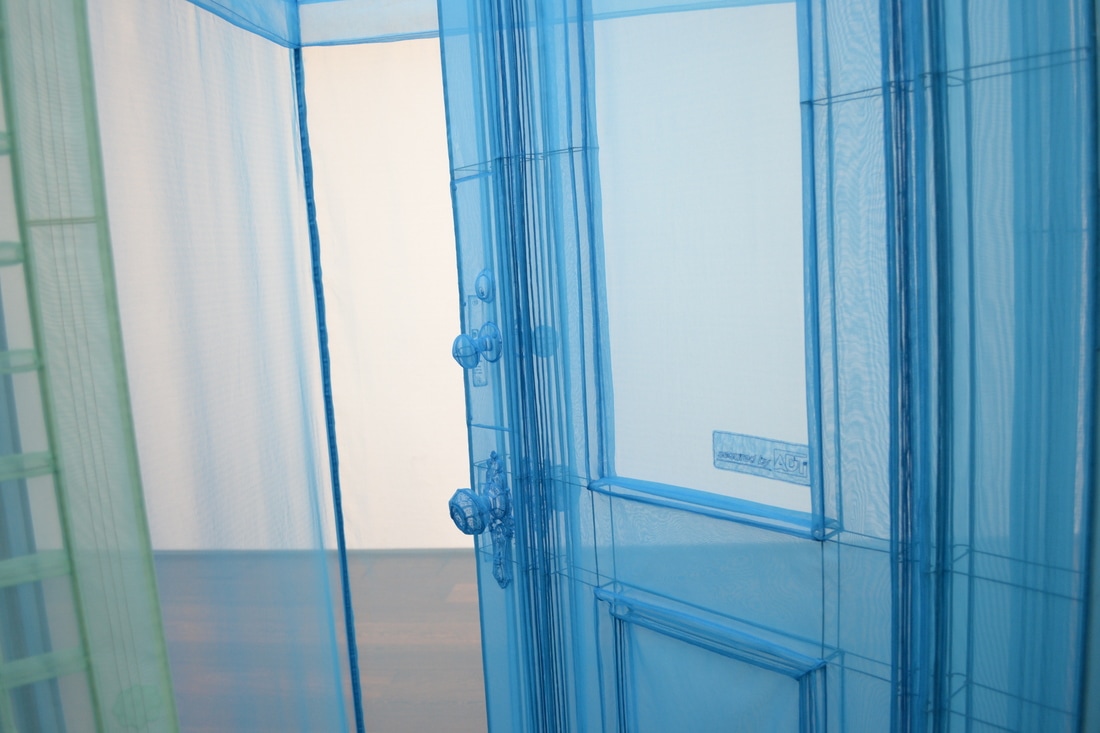 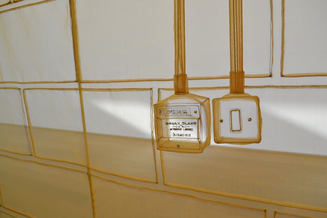 I love the colours and emptiness within Letinsky's photographs. She documents lived in scenes, what's left, the remains of a meal, the waste. These compositions clearly illustrate the presence of people, communicated through there absence. I find it interesting that you can communicate something that exists by showing what it has left behind, like footprints of a wild animal, you know it has been here, and that is what creates suspense, curiosity, and imagination. It's like a suggestion, a type of symbolism to what we already understand. I photograph the detail of interior spaces in the presence of natural light. The spaces I am currently photographing are lived in spaces, I feel like there is a similarity in my work and Letinsky's in the sense there is no person or subject, its what has been put there, artificially, but in the light of day. It's the interface between the natural and built environment. No matter how much we build and control our artificial environment, nature will always interfere.
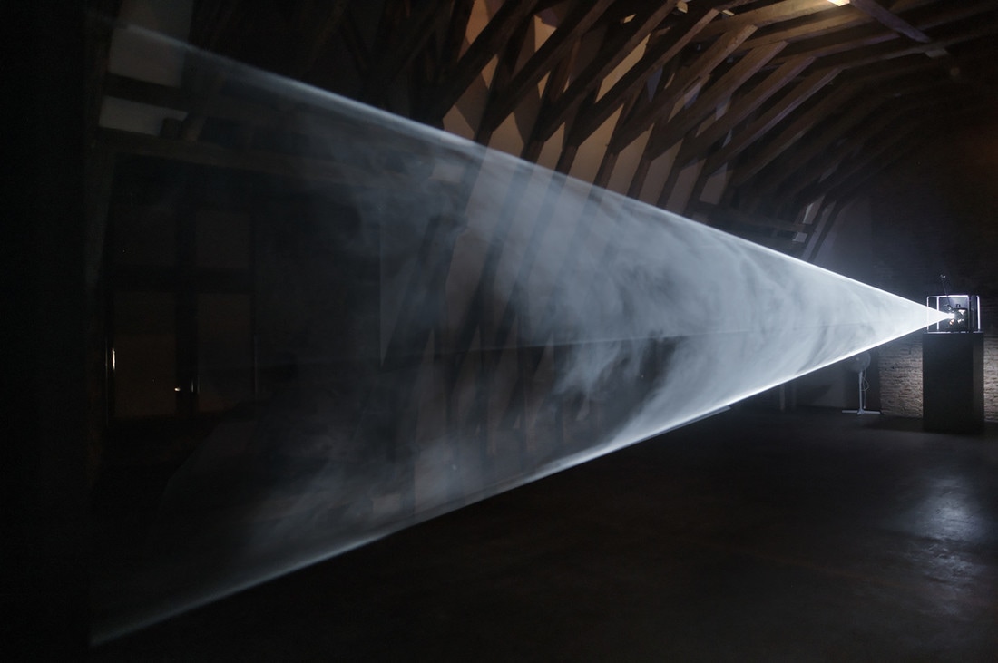
 'A Polish artist renowned for his large-scale slide and video projections on architectural facades and monuments.' His projections aim to 'empower marginalised individuals and communities, and give light to societal injustices', and to 'develop excluded communities' shattered abilities to communicate'. I find Wodiczko's values and how they are incorporated in the communication really effective. The is a functional purpose to his projections, they act in the environment they are in, recreating a confined space which hold the ability to communicate the large issues such as homelessness, war, sickness to it's audience. It brings clarity to these issues, he makes us see the in a clearer, undisrupted form unlike the real environment and communities in the our environment. Whilst I am interested in the effectiveness of his communication I am also interested in the aesthetics of his created spaces. He utilises ordinary spaces and brings elements to them which transform the way they are perceived.    I am looking at how other artists use light as an art form. Anthony McCall uses light as a material to create sculptural experiences in interior spaces. I am fascinated in how light can create the visual illusion of being a tangible material, as McCall says below, the first instinct of his audience is always to put their fingers through the vale of light, tempted to feel what they are perceiving, this action only confirms the fluidity and immateriality of light. I like how this artist uses simplistic lines to create strong sculptural forms. The simplicity of the line is coherent in the experience. In my current installation I am experimenting with projection as a light source, playing with materials such as chiffon and perspex and how they interfere with the light. I am curious to find out whether the projection creates an interface between the tangible materials and the light, or whether the light is indistinguishable as a separate element. Vales of Light, paradoxically it's quite tactile even though nothing is there, your imagination insists there is something that's solid and palpable in front of you. They appear as a sculptural, volumetric form created from 2D drawings. If you project an animation as a solid light piece, the 3D form is too complex and becomes incomprehensible, the simple lines made the most interesting 3D objects. - Anthony McCall talking on Five minutes of pure sculpture https://www.youtube.com/watch?v=5wiTHbBfy3s 
  Giuliana Bruno, Professor of Visual and Environmental Studies at Harvard University. Her research deals with visual arts, architecture, film, and media.
The text below is a conversation between Sarah Oppenheimer (a Visual artist who practices sculpture and architecture) and Giuliana Bruno documented in: http://bombmagazine.org/article/10056/giuliana-bruno I am interested in the way Bruno describes surface as a place of connection. I am exploring the use of material in representing an interface between inside and outside space. My installation encompasses a diversity of surfaces and dimensions, the interface between each of these elements is a meeting point, the way these surfaces relate and interact with each other is what drives my curiosities forward. The projection is a surface which connects to the fabric, as does the fabric and the mirror, how do these elements communicate to each other? I am now starting to think of text as a surface, how can I represent the poem as a surface which connects to the other elements? 'There is a tendency in our culture to denigrate surfaces. People say something is superficial when they want to put it down. But, in fact, surface matters. It’s so sensual and central to our lives. Surfaces are a primary form of habitation and they are everywhere in artistic expression. So I wanted to think about the surface as a place of connection, as a meeting place, beginning with the fact that our primary form of habitation is our skin. The skin is a membrane that breathes, connecting outside and inside, and it defines the contours of our bodies, of our selves. So the first surface is our body and we communicate with others through touch. In this sense, the surface is a zone of encounter between us and the space that surrounds us. A second skin that covers us, clothing, represents another layer of surface in which we present ourselves to the world. A third “superficial” envelope is the surface of the walls that we live within. And how not to recognize that the canvases of paintings, the skin of things, and the textures of sculptures are also essentially surfaces? Last but not least, we have the surface of the screens that today surround us everywhere in space. Given that we live in a world of surfaces, it seemed to me that we needed to rethink how important this connective membrane, this very elusive material of surface is. This is a material that creates contact and that can also connect mediums and art forms together. Surface is the precise site that the body, fashion, architecture, painting, and cinema all share. So, by way of surface encounters, I want to link together all these fields and disciplines that have been traditionally considered separate. Surfaces for me are ways of imagining the visual and the spatial arts not as distinct but as together.' - Giuliana Bruno  'Our goal is to create timeless, sophisticated quilts, with a hint of playfulness that are functional heirlooms for your home.' Our original poetry and stories are written by designer (and collector of words) Kerry Larkin. Themes of life and adventure and how we create our place in the world at times combine with a surreal, dreamlike world. The more you live with your Comma quilt, the more words are revealed.  I am thinking about how I can incorporate the poem into the installation. I want the words to be experienced in the atmosphere of the installation, I don't want the text to take focus away from the piece. I like how the text in the image above is not completely clear, from a distance it looks more like a pattern. I am thinking about how I could do this with my installation, showing the text in a less obvious way which works with the material and form of the piece.
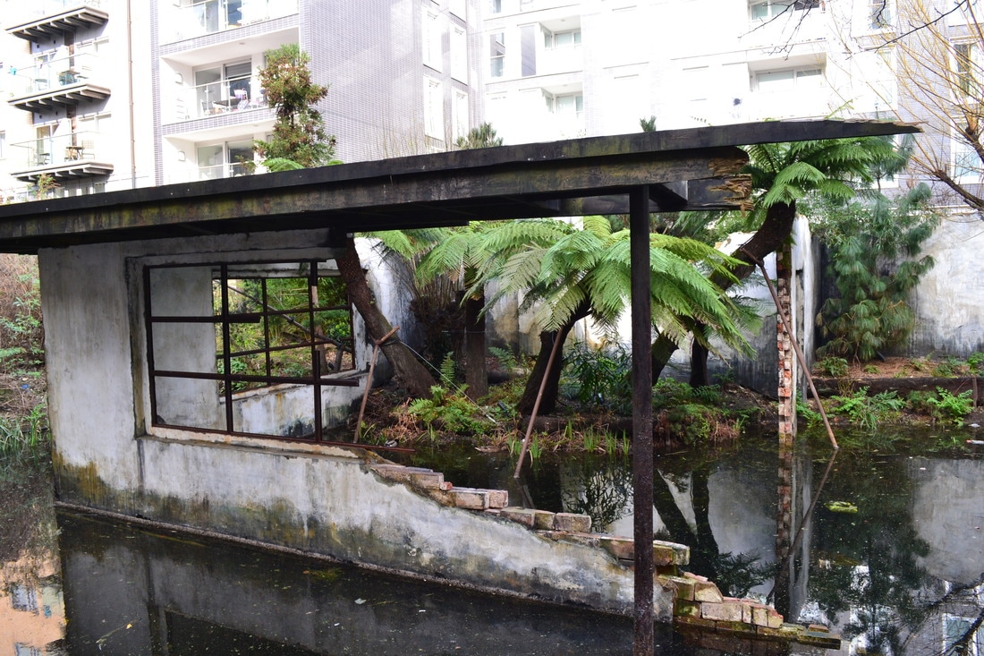
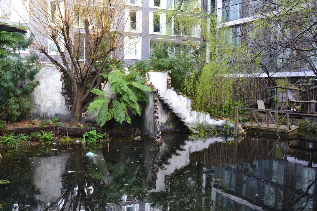
I also found it really interesting to find a company which incorporates poetry into functional, household products, it demonstrates how my practice and interests can be applied in a commercial sense. Alex Hartley (A Gentle Collapsing II, 2016, pictured). Alex Hartley is a 'British artist whose work addresses complicated and sometimes contradictory attitudes toward built environments and landscapes.' 'His work explores our understanding of utopian ideologies. His early work focused on the white cube of the gallery space; testing the parameters of art's containers. This has expanded to explore iconic modernist architectural forms, as the work considers buildings as social experiments manifested in both the built and natural environments. His practice is wide ranging, comprising wall-based sculptural photographic compositions, film-making, climbing, artist publications, room-sized architectural installations and it often involves travelling to remote places. More recently, he has made a large series of unique photographic works with architectural elements inserted as low-relief sculptural constructions. These imagined bass-relief structures and shelters are physically inserted into large-scale colour photographic prints of wilderness and extreme landscape. Hartley destabilises ideas of both iconic architecture and nature, as he questions how we occupy the world's wild places. He has taken his work into the public realm expanding the context for his work with ambitious works of land-art, employing his practice to test and expand our notions of utopia, the individual, and the critical relationship we have with the environment.' Hartley built the architectural structure within the garden pond at the Victoria Miro gallery. It was inspiring to see art work which incorporates the environment in it.
|