|
As soon as I walked into this Cafe the bright light and colours made me feel energised, but also it gave the instant impression it wasn't a relaxed Cafe. The owner informed me his choice of colours was intentional in creating a space people go to for a quick coffee or take away, he didn't want people spending hours in the Cafe due to the lack of space and seating. The space felt clinical compared to the other Cafes I have visited due to the tiles and white lighting. 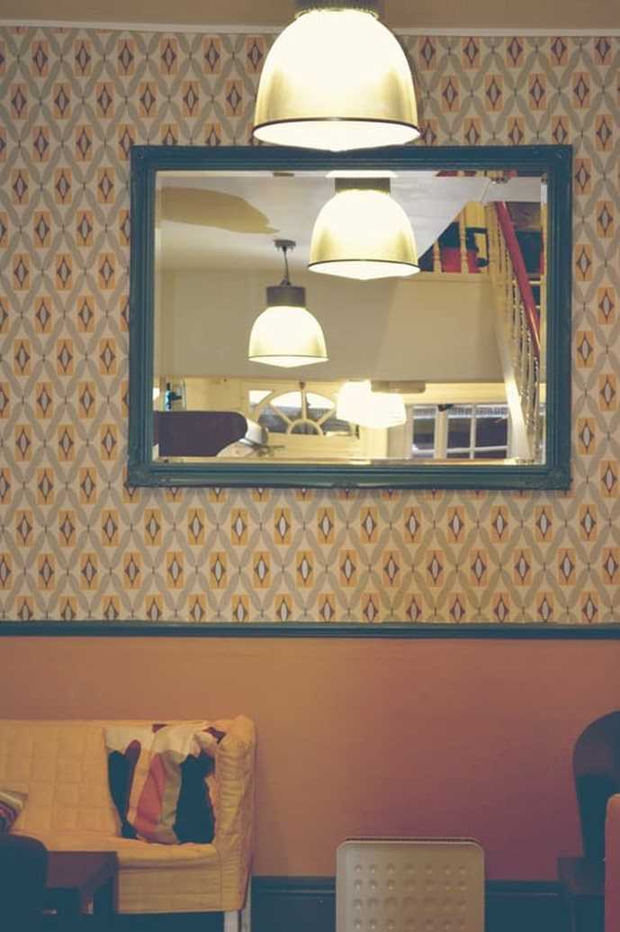 'Overcrowded environments, however, can also make us uncomfortable, as crowding reduces our ability to create and defend a personal territory. We may try to “anchor” ourselves with a physical element of the environment (against a wall or column, in a booth, or even beside a potted plant), limiting the information and stimulation reaching us and making it easier to defend our space.’ K.A ROBSON, S. 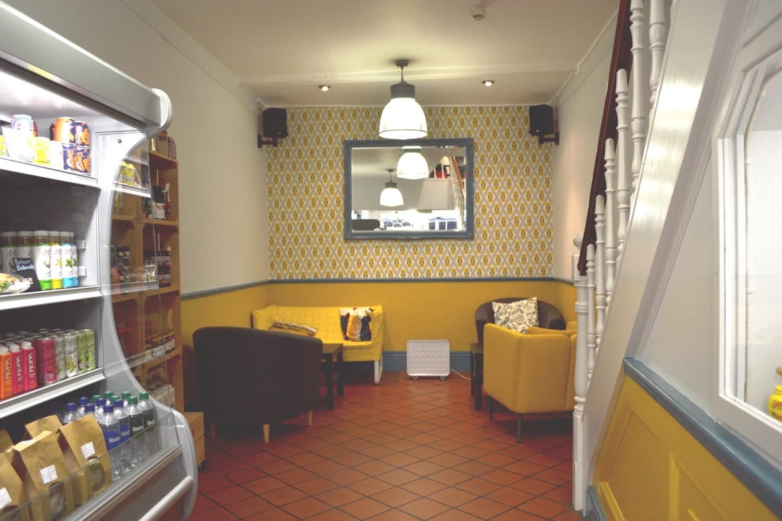 'Ketchup and Mustard theory - Red and yellow, in combination, make the perfect visual and psychological companionship for making us want to stop and eat.'
http://thevisualcommunicationguy.com/2013/10/13/red-and-yellow-how-restaurants-suck-us-in/
0 Comments
Leave a Reply. |
